Strengths and weaknesses of Windows' Modern UI, and how MATE compares

Before I proceed, I will say right off the bat, this article is going to have some bias in it. I will try to remove whatever bias I can, but I cannot say there is no bias in some of the statements which will be presented here.

This is mostly an op-ed piece, but most of my opinions presented will be rooted in fact and personal experience, whenever possible. Since this article is so damn long, I hid everything under each heading to read at your own leisure without having to do a bunch of scrolling.

Let's talk about the Windows' Modern UI

There has been a lot of controversy about the Modern UI from Microsoft. Due to it, and how poorly Microsoft handled the switch with people, as well, hardware and software failures for people who upgraded to Windows 8, there was first the Windows 8.1 release to patch things up and "Bring start back", then there was the free Windows 10 upgrade campaign (which was equally shoddy and shady in some aspects) made available last year for Windows 7, 8 and 8.1 users.

For this portion of the article, I intend to cover what I believe are the strengths and weaknesses of this approach, and why Microsoft decided to do as they did.

Strengths

Let's first cover the good aspects of Microsoft's UI decision;

The Start Screen
This was a welcome addition for tablet and convertible users. Having a menu that takes up the entire screen made tablet use more manageable, having quick-glance information via live tiles and an easily-sortable interface that, should it be exercised correctly would had made application sorting by purpose a painless process.

The rest of the system
Keeping up with this trend, the suite of Metro applications that came with Windows 10 were designed with tablets in mind. Large hitboxes for objects on-screen make the use of a stylus less of a concern for people who enjoy using their fingers, who would be more familiar with poking, swiping and tapping on glass rather than using some implement with an active or passive tip. However, styluses could still be used for people who need to write and draw a bunch on their display, where a mouse would fall short in such tasks.

Seniors, should they had given the system a fair shake would had welcome the easier-to-see and easier-to-touch interface, which for people who may lack clear vision would be welcome additions to the Windows experience, without the need to use third-party applications or the magnifier quite as readily.

Development and convergence
Microsoft made the Modern UI as an approach developers can use to create a single application for all interfaces. Should it either be a desktop, tablet or smartphone using Windows Phone, the user interface could remain the same, or similar on all devices that used the Modern UI, which should had eased development efforts to support multiple devices.

This interface convergence as it is popularly called also opens the door for special edge-cases such as phones which could become desktop PCs in their own right, and create a unified, consistent interface between phone, tablet and desktop modes.

Weaknesses

There were a variety of issues that made the modern UI problematic;

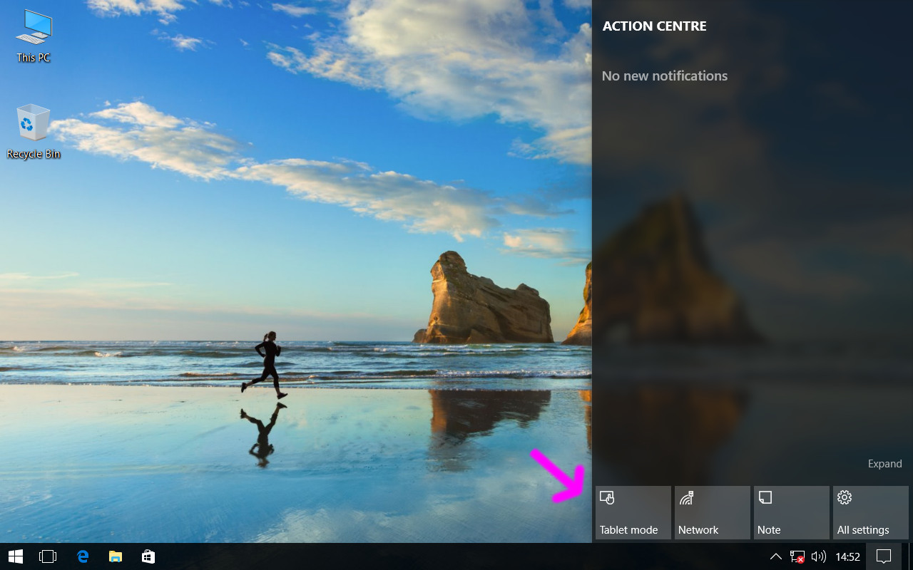
Charms and other hidden UI elements
Back when Windows 8 was shiny and new, a key complaint for desktop users was the hidden interface elements that required moving the cursor to a screen edge. While charms were removed from the modern UI in Windows 10, this and other hidden stuff which the user was not made aware of made desktop use more difficult, making it more difficult for seniors who have to use a computer, and Microsoft looking like they were was actively trying to kill off the desktop in favor for screens with bezels you can swipe against to bring hidden elements into view.

device / interface association and lack of familiarity
The lack of a start button, radical new design and features that came with Windows 8 and Windows RT made Windows feel like a completely new system for people who only saw Windows 8 as an update to Windows 7. While Windows Vista, and later, Windows 7 made sense to users who were coming from Windows XP and older, Windows 8 onward seemed more like "A Linux" than their previous system, which made the use experience negative for people who didn't expect that kind of change to happen. With no option but to roll back for users who were dissatisfied with this change and wanted "Old Windows" back, this caused a lot of users to be resentful toward the new interface without understanding the benefits it may entail.

There was also the issue of users complaining My desktop is not a tablet for people who reviled the new UI decisions that Microsoft implemented, with the Modern UI being more difficult-to-use and less featured than it is today for desktop use. For people who did a lot of multi-tasking, early Modern UI was not a welcome sight.

For those who gave it a fair shake, there were applications developed later on which re-introduced the start button before Microsoft did with Windows 8.1, re-introduced the old start menu before that was added in Windows 10, and added in hacks to the display window manager for glassy effects which had never since been re-introduced in Windows, but some of these changes came with a price, which made the "Free upgrade" one that cost a significant amount of money for people who were desperate and in need of an easy solution. Some of these commercial applications still exist today for people who wish not to risk system malfunction by messing with uxstyle and dwm.

Processor utilization and remote use
The new UI was surprisingly difficult to use on older systems without additional configuration, and difficult to use for remote system administration whereby they were more use to the older interface (continued from the familiarity issue.) Some remote administration setups were hamstrung by the hidden elements in Windows 8, and while these issues were resolved in Windows 10, administrators also grew to despise the UI for the pitfalls that Microsoft did not help users avoid. That, and being more graphically intensive made use of remote applications even more difficult to use than they already were, especially at remote areas with a poor wireless connection.

Let's talk about MATE (and other panel-based DEs)

We all know it, we all love it, we all use it. But if you read the previous section about Windows' modern UI, you'll have seen I went in-depth about the strengths and weaknesses of Microsoft's offering. While Microsoft, GNOME and Canonical were busy trying to put all computer users into the same pile, there was severe opposition from a significant minority who wanted things not to change for a variety of reasons. They got their wish... sort of. Does the traditional desktop metaphor still work today?

Strengths

The MATE DE excels at being the same thing you used on Ubuntu and Windows prior. Here's why;

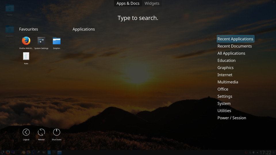
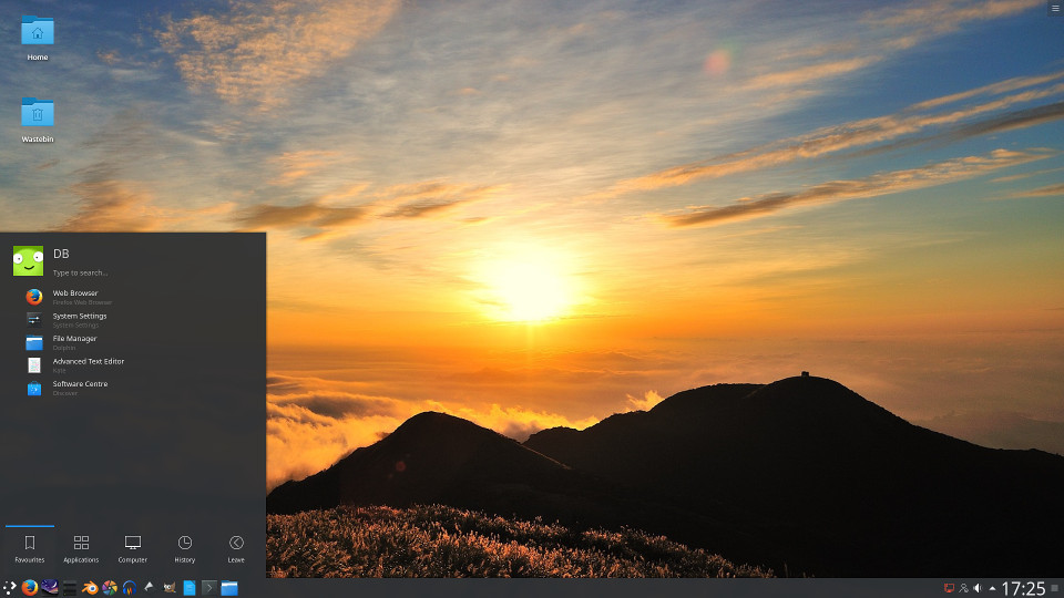
The Linux DE you know and love
If you began using Ubuntu, Debian or Fedora back in the day, you probably encountered and stuck with GNOME 2. Being that MATE endeavours to be a GNOME 2-alike, users from the legacy spectrum of Windows and older Linux systems will find the MATE DE to be a welcome addition, using a panel-based interface that can also easily work as a lightweight launcher with the use of MATE dock, a third-party software offering similar to Docky or Plank which some distributions (like Ubuntu MATE) include to round out MATE panel functionality.

Because it is a desktop environment made for the desktop PC, a lot of information and lots of options can be presented at once before a scrollbar becomes involved.

Extreme customization
Considering that there is very little integration with anything that is not a core system component, software can be swapped in and out, and made default any time without much risk of things breaking, so long they use GTK or play nice with the daemons provided by MATE. While this was the kind of stuff to be expected from a Linux desktop, there has been a movement by some DEs to have integration so tight, use of anything else may very well break the interface and limit use of the desktop to a shell terminal.

Microsoft Windows use to be nearly as customizable, but again, Microsoft fell into the trap of integration and now with Windows 8 onward, the file manager can't be replaced as easily in present-day Explorer shell as it could with offerings like Explorer++ or Xplorer2.

A common thread
Like GNOME and Cinnamon, MATE uses GTK so not only is there a common interface framework between GTK desktops, there are also common theming engines. This means applications from other GTK environments will look good and fit in. If you came from legacy Fedora, legacy Ubuntu, or Linux Mint, you'll most likely find yourself at-home.

Because a lot of the interface is the same between GTK-based systems, any software using GTK2 (and to some extent, GTK3) will work on just about any of them, including Ubuntu MATE. There's no reason aside from library issues why a piece of software from Xubuntu wouldn't work without XFCE bacend files and the applications themselves, but XFCE apps never need to download an entirely separate set of interface libraries since it's GTK.

Weaknesses

Where MATE and other panel-based interfaces are strong, it is also their Achilles' in certain respects. How so;

Lack of touchability
Being a non-mobile interface for the desktop, it is made for mouse and keyboard in mind so using it with a touchscreen is folly at best, and ludicrous at worst. Because of this, Ubuntu MATE is ideally usable on a desktop PC, and on a laptop. But since the interface normally limits itself to small hitboxes, there is no way this could be used as a tablet or phone interface without significant modification.

At a certain point, a user may find it is better to use a desktop with an interface made to be more mobile- and touch-friendly than anything with MATE and similar. Due to a lack of a "Tablet mode" like Microsoft has for Windows 8 onward, use on a touchscreen display may prove more difficult than it has any right being.

Differing configurations
Between each system, things are configured differently so when trying out a different GTK-based environment, some workflow habits must be changed. This should be expected, but there are many people who will decry about their GTK system looking different from someone else, or be confused because something is a little bit off. This resolves itself with time, but change is harder to endure and longer to take for some than others.

Ubuntu MATE, specifically has plenty of panel configuration options, which means one man's install won't be exactly the same as another, especially regarding panel layout. This is symptomatic of human beings having differing ideas of how the desktop should look, whereas for a mobile interface, things are mostly the same between devices.

Dated appearance
If you want your machine to scream USER WAS BORN IN THE 80'S, then using an old desktop interface like MATE is a good way to start. Not that there isn't anything good about that initially, but to make the traditional desktop look modern, a lot of effort needs to be imparted by the user for others to see their desktop isn't twenty years old.

While there are software and tools to make the desktop feel more modern, it'll still be in the old, dated theory that the desktop should represent a digitized version of your desk. For some this is alright, for others they wouldn't dare touch it.

What does all of this mean?

...Not much? Nothing definitive, however, The takeaway from this article is the idea where different hardware applications require different approaches to be used optimally, even if the interface is to converge and become this one massive lump. With developers wanting to make their lives easier, and most common users wanting things simple and easy to use no matter what, it seems then rather paradoxical that people would rally against a common UI, until it is realized that people had been using the same interface paradigms for a number of years prior to Windows RT and Windows 8, or Ubuntu prior to 2013.

For those that don't like the idea of convergence, they can stick with Android and an older GTK2 or GTK3 panel-based interface for their desktop. And that's pretty fine by me as a common user, Not unlike the mandate of 16:9 resolutions by big media, convergence was touted as something that was better, but left legacy applications in the dust, which some of those legacy applications are required (or at least preferred) even to this day.

What do you think about it?

3 Likes

Great article! :thumbsup:

It means that Apple wins. Well, I’m biased. But the way I see it desktops and laptops use a panel-based DE, mouse/keyboard with or without additional touchscreen.

Phone/tablets use touch UI. It’s completely different from panel-based DE, because… it’s made for touch…

The only devices that would benefit from convergence a la Windows 10 or Unity 8 are the hybrids. Hybrids are tablets with additional keyboard. If you buy a hybrid you probably don’t want a laptop, so you should really be happy with a touch-only UI.

I’m no Apple fan, but I think they nailed it.

Desktop/laptop (Mac): Panel-based DE (MacOS). Should come with touch-screen too, because it’s useful if you disable touch-pad.

Phone/tablet (iPhone/iPad): Touch-based UI (iOS).

Hybrid (iPad Pro): Touch-based UI (iOS), because it’s nothing but a glorified tablet and people who buy this sort of thing don’t want a laptop but a tablet.

If you buy a laptop with a non-detachable keyboard, why would you want a touch-UI? Admittedly, I don’t like touch and that may be the reason I don’t see the point of convergence UIs.

I also realize I may be a small but vocal minority and people love hybrids and convergence. I can’t help but finding it very gimmicky.

Also convergence UIs must be a nightmare to develop. Firefox has a desktop build and an Android build. You sync your browsing activity between the two. Imagine the pain Mozilla devs would have to go through if they had to develop a convergent version of Firefox. And it would not have the power of the desktop version. Convergent applications have to focus on the least capable UI, the touch UI, so the desktop side gets dumbed down.

My two cents… Feel free to argument why I’m totally wrong about this! :grinning: :wink: :innocent:

PS Why isn’t Apple winning? Well, lack of customization options and price points that make you grasp for air…

HP are marketing a phone you can dock as well. Don’t forget about that. We should be hoping and praying that Thunderbolt 2 is heads and shoulders over Thunderbolt 1 so we can potentially have the performance of a 4X PCIe 3.0 slot in effect with one of those fancy PCI bays people use desktop video cards with.

In fact, that’s a future I would want; You wake up, see what’s going on with a large display, then you disconnect your phone from a dock and it goes into phone mode, hook it up in some school or university in some shelf under a desk and use your phone in desktop mode there, later taking it to work and docking your phone there to do work things, if you need to; in the future companies might not need to exist as they do now and the brick-and-mortar shops will entirely be no more. (Which makes me wonder why Amazon is even trying with Amazon GO.)

There is also the idea of carrying a biger display and with a physical or wireless connection interface with the phone to use it in tablet mode, then if smartwatches ever get up off the ground the phone can push information to your smartwatch as it also does wireless video to a tablet.

Dumbed down, or more friendly for people who have difficulty seeing? It’s an accessibility feature in my eyes, even if it means the interface is a bit dumbed. And frankly it doesn’t have to be; a screen full of options should be handled with a fisheye effect so you have the functions of a desktop, with a drag-and-tap function to select things.

Too bad nobody ever though of implementing that in a sensible fashion.

Because Apple wants to present anorexia as beauty and people are growing tired of it.

Problem with hooking up your phone to a display is that all of a sudden you actually need your phone. Like someone calls you (still happens).

Also why would you use a weak and thermally challenged phone to drive a display when you can have a 4-core 8-thread 65 TDP processor in a box the size of an Intel NUC or slightly larger?

On the desktop you can never have enough power. Chrome eats RAM and many modern sites are quite CPU intensive. Add an Office-suite and other applications to actually get work done and soon your productivity will be hampered by limited phone hardware.

Your phone will get warm and Galaxy Note 7 shows what can happen when batteries get hot :wink:

I don’t want to sound negative. I’m conservative and I’ve seen complicated solutions fail.

Motorola had the Atrix smartphone (3 in 1) and Asus had the FonePad (2 in 1). Solutions that require some kind of dock seem to be too complicated for the market.

Even laptops docking to displays are less common now that you can get small and powerful desktop PCs.

I’m all for innovation, but unless ordinary people find it easy and useful, it won’t become a success. Part of Apple’s success is that they kept things simple.

Apple lost their way with Mac touchbar and anorectic iPhones, but compared to Microsoft they are better positioned in the consumer space.

If it wasn’t for limited customization (awkward UI) and price, MacOS would be a serious threat to Windows 10. Imagine MacOS with MATE desktop. That would be something…

I have a small feeling it would be XFCE on those desktops, if for nothing else Thunar and xfdesktop work well together and xfdesktop being easier to place icons upon.

Excellent article @tiox … good job removing most of the bias!

While I appreciate the discussion with @mrtribute :yum: the article would be “better” if the major points from the discussion were included with the result being good guidance for new adopters of Linux who are technically savy otherwise.

@tiox, your analysis seems mostly on the mark to me (dunno if you’ve read my blog but there’s some gob-flapping in there about interfaces and gestures and suchlike).

Touch is not there yet. The initial devs took their best shot at getting something to work ASAP because that was their job. The marketeers sold it up. But it’s far too easy to do something unintended, just because the gestures are not ergonomic. Even a simple tap-attempt can turn into a long-press or a move if you’re spazzy like me, or too quick, when a few ms can make a difference, there’s no “machine learns how you gesture” setup, and that’s essential imo.

And linux (more, the whole binary-architecture world), is suffering because it’s been built from pieces put together along the way, trying to do everything for everyone. Simple things offer evidence of the way everything from basically 1969 forward has been driven by old-tech (which was leading-edge back then). Disbelievers can start by examining the realm of options for the simple tar command, where options exclude instead of the exclusion being done in a previous pipe segment, and the list goes on from there.

There are several modes of interface that different people find comfortable, depending on their physical abilities and what they’re trying to do.

Bah, nuff sed, i tend to get preachy, sorry.

No, i for one don’t think Apple wins. I think the only thing Apple can do is hope to be the first one to replace their fingerprint sensors with DNA-readers, because i don’t think much less will save them.

I’m seriously considering replacing my iPad Pro with an HP X2. The iPad has some good apps, but mostly the thing is hard to use. If I’d wanted a tablet i wouldn’t have a logitech keyboard stuck on the thing, their connector is far less reliable than anything with a pogo connector.

And touch is real and getting more-real under linux, i can easily touch a panel icon on this xps13 and bring something up. Personally i dislike moving my hands off the keyboard any farther than necessary when trying to do work.

Whatever, maybe i’m old and set in my ways, but i think they’re good ways to be set in, i think computers are tools and tools should be easy to use whether you’re an apprentice or a master.

Just for the record; I wasn’t trying to be objective. :smiling_imp:

It’s for a simple reason; I think User Interface is a subjective topic.

Some people like Unity, some MATE, some KDE, some Windows 10.

The only objective thing I can say is that MATE can mimic Unity, but Unity can’t mimic MATE. But Unity purists would probable oppose that statement so it might not be very objective at all.

I realize this thread is about Windows Modern UI. To be honest I don’t have a whole lot to say about that. Maybe the Modern UI isn’t that bad, but it reminds me of modern smartphones so I don’t use it.

My very subjective opinion is that smartphones should look like Nokia N900 with Maemo OS. It ran desktop applications too, just like Ubuntu Touch.

There. Right there. The interface / device association I talked about prior; you just exhibited it The Microsoft Modern UI looks like it belongs on a phone so you deem it unworthy of the desktop.

I was there myself, for a long, long while. But as I look ahead with some foresight I can legitimately see desktop users preferring larger buttons as they get older, for the sake of visibility and that’s one of the core strengths I see the Modern UI having. Unlike just easing back the DPI of the interface or using a smaller resolution, bigger buttons with bigger text should let users keep their native display resolution and exchange information density for information visibility, which should be especially handy if just waking up and rubbing the salt from your weary eyes.

For people who noticed the awful comma slicing and writing which made it look like I had marbles in my mouth, I initially wrote the article when I was half-asleep, and waking up; two of the worst times to begin anything long-winded. Hopefully I cleaned everything up and made something worthwhile for a Linux blog, all-the-while keeping it in a medium we can engage peaceably and objectively in.

When half-asleep and waking-up is the best time for writing imo, often i find that some of the things written down are answers to other questions that have been nagging, and which seem entirely unrelated to the topic at hand. (Usually i find these things just after i proof-read what i’ve written and say, wtf does that mean, and what does that imply, since implications are usually the more fruitful side of that equation imo.)

I’m convinced beyond any doubt that it’s entirely possible to have fully interchangeable user-interface paradigms, one for text-only, one for icons (do kids still speak english?), one for speech, one for what-have-you. I’m convinced that these can each handle the full deal, and that they can be made independent from one another, interchangeable on-the-fly, regardless of what OS is running.

It’s a matter of designing a proper transaction protocol between the human and the system, sufficiently abstracted and also sufficiently precise in detail so there is no misunderstanding on the side of the human and no mmisunderstanding on the side of the system. That demands a one-to-one correspondence between names and concepts, which then permits the names to be changed without affecting meaning of the thing, its semantic context, what it does.

I’m also convinced that talk is cheap, but one of the nice things about computers, is that once you’ve laid the code and run the thing and it does exactly what it’s supposed to in every case, it’s right enough. At least that’s my thought on it fwiw, as i try to stop talking and write code. :innocent:

I am not a coder and so freely admit the following is drawn from a bottomless well of ignorance.

But, I simply do not understand why it should be beyond the wit of coders to produce a single OS that looks and acts like a tablet UI when housed in a tablet and looks and acts like a traditional Desktop UI when housed in a desktop machine. The UI is just a skin on top of the underlying guts of an OS at the end of the day - isn’t it?

What am I missing?

Hallo everyone

“Computer” (i.e. everything with a cpu and ram) users fall roughly into two categories, twice.
(i) those who care about understanding what’s going on
(ii) those who “just want it to work”
(a) those who consume content
(b) those who produce content

For anyone who seriously believes in “one-size-fits-all” I have only one answer - shoes.

I see nothing wrong with tablets being used to consume content. I tried to produce content on a tablet for about 18 months and then realised that it was simply the wrong tool, at least for me.

But what I personally would like to see are e-ink tablets that have a colour capable screen. I’ve no idea if it is possible, but it would be better for our eyes and world-wide electricity consumption.

But back to the subject on hand. If Redmond or Cupertino bring out a new version of their software they can completely change the DE as they see fit. Linux users generally have options, so that they can maintain consistency of their “user experience” (seriously, I never thought I’d use that phrase) as they wish. I like that. :slight_smile:

1 Like

I don’t think you’re missing a thing. It’s entirely possible. It’s just the mass of details and workarounds and hoop-jumping that obfuscates the situation to the point where it’s all about the details and we’ve forgotten what they’re for. It’s also about the environment in which coders code.

When you’re writing code because that’s how you feed your family, it gives non-coding management lots of power to jerk things around due to schedules and competition and profitability constraints, and in my experience their bottomless wells of ignorance are fully adequate to the job.

It’s from the independent FOSS community that hope better spring imo, because the corporate world is interested in corporate image and corporate profitability and those are not contributory to the development of good software, those are factors that contribute to company-specific walled gardens like the one surrounding things Apple.

1 Like

[quote="stevecook172001, post:14, topic:12075, full:true"]
I am not a coder and so freely admit the following is drawn from a bottomless well of ignorance.

But, I simply do not understand why it should be beyond the wit of coders to produce a single OS that looks and acts like a tablet UI when housed in a tablet and looks and acts like a traditional Desktop UI when housed in a desktop machine. The UI is just a skin on top of the underlying guts of an OS at the end of the day - isn't it?

What am I missing?
[/quote]While I don't want to use Windows 10 (except as a virtual machine, without Internet connection), the developers have implemented the feature you mention? In Action Centre one can easily switch between tablet/desktop mode. No doubt a similar feature will be added to GNU/Linux. KDE is almost there, so they may be first?

Windows 10 screen capture

2 Likes

GNOME has been there for some years now with their one-size UI, all they would need to do is take some cues from Cinnamon and make a more desktop-oriented version of their UI.

I think, from the convergence viewpoint if there are two different interfaces then that would mean developers would need to create two different implementations of the same elements whereas if there was one UI for everyone then developers would only need to code for one system interface instead of a variety of child interfaces from the same family.

Also, figured I should mention this; When I wrote the article I wanted to provide a rationale for why these convergent interfaces exist, and present with as little bias as possible so users can weigh the good, the bad and the just plain ugly to allow users the means to decide for themselves which interface they would want with information at-hand.

I certainly hope MATE doesn’t go the direction of Unity and GNOME Shell however because MATE was made to be a GNOME 2-alike, since GNOME decided to abandon the traditional desktop. I would rather see MATE and Ubuntu MATE cease development and discontinue their projects than to have MATE stray from their roots.

It’s a matter of creating a user-interface abstraction sufficiently general to maintain the man/machine communication process without binding the abstraction to any given implementation.

Then you have one interface between application and system, with system providing as many different implementations as desired. One implementation per user-selected “theme”, whether the “theme” is an all-text interface or an all-gui interface or a voice interface or whatever. The application programmer than has one interface to code to, the system becomes the implementation-provider, the application coder gets to use the simple abstracted interface, and the end-user gets whatever kind of interface he wants… though if one that he likes isn’t readily available, it would need to be coded up and stuffed into a repo someplace.

Of course you’re back to the same question of language-specific bindings for all the various languages, but that’s business as usual. The point i’m offering here is that it can be done, and it isn’t necessarily rocket-science.

[quote="tiox, post:18, topic:12075"]
GNOME has been there for some years now with their one-size UI, all they would need to do is take some cues from Cinnamon and make a more desktop-oriented version of their UI...
[/quote]Agree with your comments. When mentioned "KDE is almost there...", I was referring to being able to switch easily between full screen type menu (Windows 10 tablet mode, GNOME) / standard desktop menu, as seen in the following KDE screen captures.

Sorry unable to reply sooner, screen captures were on a different system.