Ubuntu Mate needs to be more beautiful and attractive

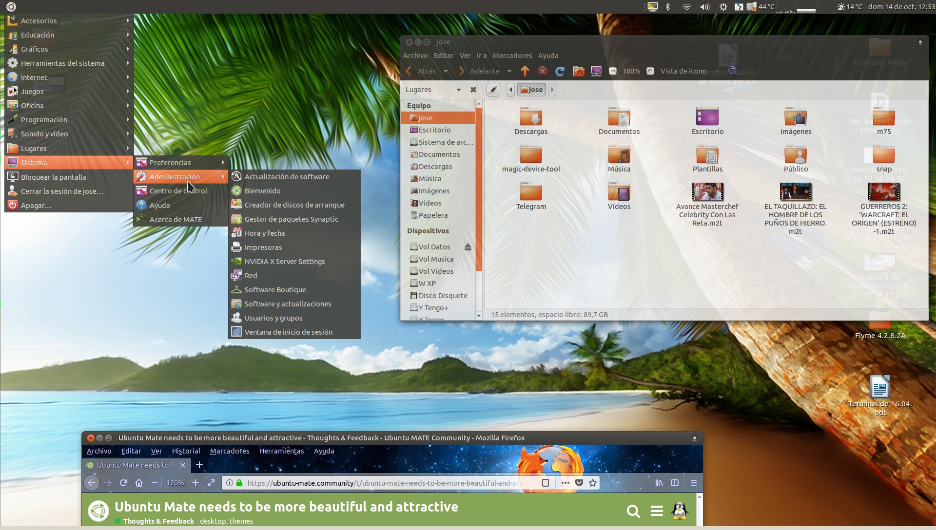
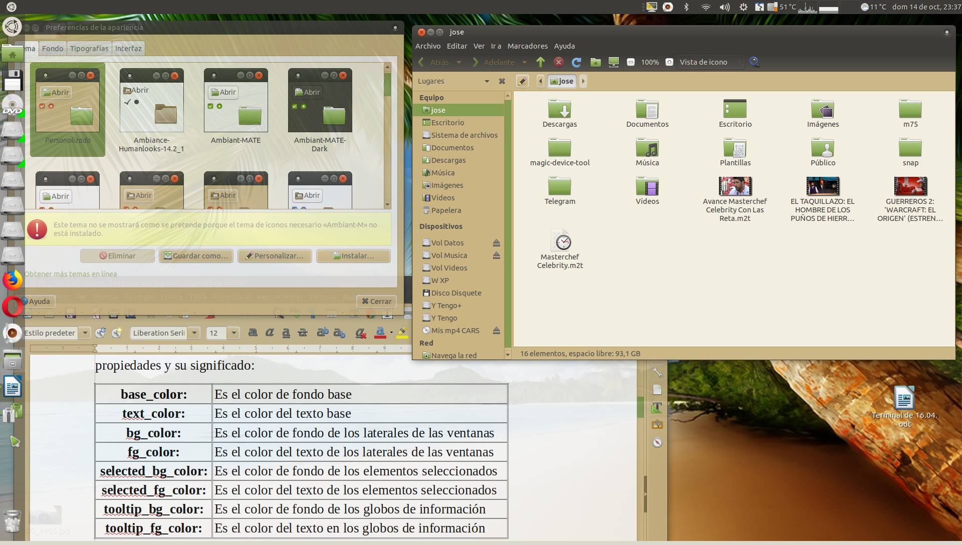
Is there a possibility to improve Mate Design?

Mate Green and the theme are ugly, the wallpapers are also not very beautiful.

The Solus OS (Mate Edition) is an example of how to have the beautiful Mate in a distro.

Please do not interpret what I said as a negative criticism. I love Ubuntu and Mate, but I think Ubuntu Mate could have a much better design by default. This will also attract more users.

Ubuntu Mate can be a highly recommended distro for novice users coming from Windows, but due to the aesthetics, many prefer to go to Linux Mint with Cinnamon.

Is there any plan to make Ubuntu Mate much more beautiful and attractive?

Thank you!

7 Likes

there have been various themes made for Ubuntu MATE but none are currently shipped by default , but Ambiant MATE is currently the default, also we do have some pretty nice wallpapers, although beauty is in the eye of the beholder, here are some themes for MATE designed by the community https://github.com/willscreel/Communitheme-Gray, https://bitbucket.org/rstrcogburn/themes, and https://www.deviantart.com/dolsilwa/art/Arbeit-18-04-05-dark-beta-Ubuntu-MATE-theme-755754418

Yes beauty is subjective and everyone can customize Ubuntu Mate in the way they like.

But there are several details that makes most people consider a beautiful distro or not.

And in my opinion, I think that Ubuntu Mate could be much more beautiful and elegant by default, and thus be able to attract many more users.

In the name of “attracting new users” we now have a default layout that has nothing to do with carrying on the Gnome 2 legacy. I’m all for beautifying Ubuntu Mate. But let the new users fall where they may.

6 Likes

And I think it still looked better only with one panel by default, like Windows, Linux Mint or Solus OS with Mate. But it’s just my opinion :slight_smile:

STOP.

UBUNTU MATE IS THE BEST,
I like everything. the design is just amazing. Every corner on the desktop is just perfect, I just insanely love it.
I am not involved in anything on Ubuntu Mate but I ask the designers, the developers to leave it like it is, to keep the same good taste, is just insane, I love everything. (I keep the default theme just adjust the position of the top bar to bottom and add a left quick application bar). I just love the latest wallpapers (with triangles and logos), on some system I keep the green one on other the grey one, just to remember on what system I am, but I like more the green one, the grey is too passive but elegant)

I have not login to this forum from some time , I do it for this specific topic.

I am also happy that on Ubuntu Mate 18.10 they focus only on fixing bug fixes, and I know that 18.04 quite have some annoying ones, so this just sound amazing.
When I have some time I will give it a spin, and probably update after all my desktops.

THIS DESKTOP IS JUST FANTASTIC …

2 Likes

I would have loved to have an included theme with less gradient. Call it flat if you will. I resorted to Mint-Y-theme but it is not perfect. I really like the green accent and the Ambiant MATE theme but it’s heavy use of gradients seems very outdated and distracting to me.
Any suggestions for an alternative?

I understand what you mean, KDE Plasma it might be a better place for you, if you don’t find a theme that suits you.
For me KDE it just feel to washed, too faded, is like having a grey painted car, something without personality.
Mate Desktop is somehow vibrant it is like it has life, it has passion in it, without going on extreme like par example Windows XP default theme, or rounded icons on Android or Gnome, I don’t like that… so it feels just the right design for me, I just love it and appreciate the taste of this desktop,

Right now I like um. But every product has a cycle. So at one point the design needs a fresh look.

2 Likes

Hello Guys, Ubuntu MATE to change to gnome3 has lost the ability to change backgrounds and windows, unless you know a lot about the system you can not vary the colors, I've been looking themes in gnome-look and my God I do not like the themes , there are themes with very strong or very simple colors, I do not change colors in gnome3, the predetermined themes I do not like so much and it is true that MATE loses elegance, I show you two photos of what I like, I think which is elegant and pleasant,

Regards...

,

I installed the arc theme love that theme

Does it work? Check.
Is it secure? Check.
Is it stable? Check.
Is it pretty? Don’t care.

6 Likes

This is my current desktop, Compiz makes it quite nice because of the transparencies, but I lack my warm colors in the windows, my daughter has the windows in pink and the folders in purple, when update will finish the colors, but as says Tiox ... we have the best operating system

1 Like

I totally agree with you, but I found in this life that beauty is an important quality for things and persons.

Maybe some people par example buy a car as cheap as possible, second hand, ugly, dirty, some buy Rolls Royce or something that they like and afford.
If I dedicate my time to using a tool, a software, a drill machine,… I want to enjoy using it, I like to look nice , new, in good shape.

I always appreciate a good design, a professional one, I don’t like fancy, shiny staffs, because they just look artificial and fake, like par example chromed plastic on cars, is just fake, in my eyes it just lower the value of the product… but if I see something par example from stainless steel, even if it does not look so nice like the chromed plastic, it just look more professional, high quality.

When you look on a girl you chose one that you like, and I don’t think you think on her just to be “functional” to do things for you… :slight_smile:

You are right but everyone has their preferences.

1 Like

I like those orange folders @Josele13 :slight_smile:

From what i know the theme team of Mate it’s a small one (when i say small i say max 2 ppl). I am on the same boat, Mate feels a bit old with the current theme and icons. We have a black version of the standard theme that it’s unusable, the icons are from 2000-2005 from my point of view and the current control center layout it’s old. Yea we can have this version of Mate but will be nice to have a modern one alongside for the younger user base (if we want to have a younger user base). But again we don’t have devs, no documentation up to date and a user base that doesn’t know the difference from a open source project and a payd product. Again this is my opinion amd point of view.
P.S when i say younger user base i am referring to the users that comes from a modern look like gnome, mac osx etc.

1 Like

Hello guys, as I am a person of much struggle, I have achieved my goal, taking as a base a theme I have created my own, one in green and one in orange, but not everything is joy, there is some programs remain in the background of MATE,

for my perfect, greetings ....

Hello Steven, I love orange too, I downloaded the gnome-look.org theme,

I send you link: https://www.gnome-look.org/p/1246319/

regards…

1 Like

A woman is not a computer UI. Perhaps the opposite. Bogus analogy.

2 Likes