I find that the fonts in the MATE terminal are a bit blurred and indistinct. I compare with my older machine that runs Gnome 2. I have tried the same font settings under "Control Center -> Appearance -> Font" but I can not get as good as in Gnome 2.
Does anyone have any tips what to look for?
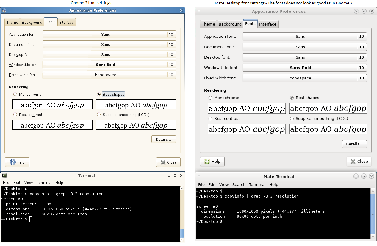
Here is a picture showing the difference. Note the fonts in the terminal to the right are not as sharp as in the terminal to the left (Gnome 2), please click on the image
The image in my first post is taken using the same monitor. Comparing the terminals to the left and right, the one on the left looks better to me, it is sharper. Compare e.g. dollar sign, it looks a bit blurry in the figure on the right.
You may be right that I'm missing some graphical drivers. Any idé how I can check the drivers used by Mate Desktop?
You can try searching for some missing drivers inside Mate Control Panel > Additional Drivers.
Maybe it's matter of screen quality or something but the only difference i can see on your screenshot (rendered by my graphical card and displayed on my monitor) are the $ sign and the . at the i letter.
Are you using HDMI port from your graphical card up to the monitor ?
 Welcome to our community !