in mate-applications.css. Change that to 1 and you get 16.04's "tight" spacing again. Even 2 is probably more than enough for anyone.
What's interesting though is that "Computer" still has a huge blank area both above it; and beneath it before the home dir etc are listed. The "Network" section that follows it IS spaced correctly though, both above and below that section heading.
So it looks like there's something "special" about the first entry in the treeview, and the additional spacing on all the other rows is actually just a hack to match that.
I'm guessing that's because the treeview itself is buggy (possibly by GTK3 intent?) and that first line couldn't be fixed, so all the other lines had to be padded out instead. Is that what happened?
I don't seem to be able to drill down into the treeview itself with GTK Inspector, but that may well just be my lack of familiarity with it. There doesn't seem to be any property in there that controls this - at least, not one that I can find - but that seems almost impossibly unlikely.
As far as the spacing in the file panel goes, Menta has the tighter spacing of 16.04, so it looks like TraditionalGreen is at fault there, and it can be tightened up just by finding the right piece of CSS.
Menta also tightens up the Places view to match 16.04, but even then still has the same issue with that first line having excessive whitespace around it. I'm guessing (again) that it's because it's being treated as a column heading.
Does anyone happen to know of a way to fix this, to save me having to wade through GTK to try and find one?
the vertical spacing there is ALSO huge: quite possibly 2x what it should be, not +2px.
In both cases, you have to use either 0 or 1, or the spacing just goes insane. What's especially odd with the side panel case is that "2px" DOES work correctly for all the elements AFTER "Computer", just not for that one. In the file window, it's broken (i.e. 2x) for every file, so IDK what the differences are there, but at least I have a solution for now, and I'll investigate when I have more time.
It does work properly for 0 and 1: at 1, you can see a 15-line display of 10pt text gain roughly one more visible line vs at 0, but anything over 1 and it just explodes.
GTK Inspector doesn't show padding for those elements, regardless of the padding you specify, so I have no idea where it's pulling its numbers from, where they might be inherited from, and so on. Again, that'll have to wait for more free time or someone who actually understands themes to share their knowledge: I'm basically just stabbing at things randomly.
My theme doesn't have a mate-applications.css and definitely has zero problems with treeview spacing. Like you, I was dismayed by the spacing issue and downloaded Clearlooks-Phenix to get rid of this stuff.
Try disabling the .css by renaming it .css.disabled, log out and back in and let us know what you see. Clearlooks-Phenix doesn't have a mate-applications.css and seems to do fine without it.
Edit: You are right, the spacing issue has been around since at least 18.04.
Yeah, that was next on my list, but I don't think I actually need to.
0"px" is very tight, and that's what it should (had better!) default to; 1 adds a tiny - but clearly either truly correct or coincidentally so - amount of extra space; and 2+ is comically broken.
"since at least 18.04"
Thanks for checking. Whether it's GTK3 or just a bug that made it into all the themes somehow is anybody's guess, and I'll have to wipe out all the CSS to see for sure, but I'll do it soon enough.
In the meantime, that fix has made all the difference in the world to my 720p HTPC, because the crazy padding was pushing the bookmarks off the bottom of the window even when it was close to full screen. I'd certainly recommend it to anyone on an old / low-end laptop too.
(At some point I'll make a PR for all the fixes in my copy of TraditionalOk, but even if it's accepted it won't help anyone til 20.04, so it's good to have this stuff in the forums as a stopgap).
So to eliminate the 'double' 2px, you might want to try:
padding: 2px 1px 0px;
So the padding only applies to the top-edge. There's also margin which behaves in the same way. Though I only tinkered a few times with GTK's implementation of CSS.
and it doesn't. Not even close. The second one works correctly. The first is utterly broken, with the spacing between folders being close to double the TEXT height, not double the PADDING. That's what I was trying to say before, but phrased very badly, sorry. The spacing between FILES with that first one is absolutely random, ranging from 2px to, again, double the text height.
Except, EUREKA, I've just found the pattern.
With 2px 1px 0px 0px, IMAGE files are spaced (pretty much) correctly, but TEXT files have massive spacing - it's because of the vertical height of the icon! (This is in List View, which I should have made clear earlier, except it's the only sensible universal option despite not being the default (sigh), so I forgot there even WERE other display modes, sorry!)
I did also have a margin line in there at 0 0 0 0, which also made no difference so I pulled that too in the interest of simplicity / clarity / minimal random noise. I think there's quite a lot of copypasta in the theme files these days as a result of people struggling with GTK3 and just duplicating things. (I don't blame them at all).
I've got the same lack of knowledge re GTK's behavior, unfortunately. There doesn't seem to actually be any worthwhile documentation of it, and the corresponding pseudo-methods in the APIs also seem to just be doxygen generated and not really of any use to anyone unless they're already familiar with the actual implementation and just need their memory jogged.
I've been using Ubuntu MATE 16.04 for years now, and I just upgraded to MATE 20.04, and I am seeing this excessive spacing in Caja... and it is extremely annoying.
How do I fix this?
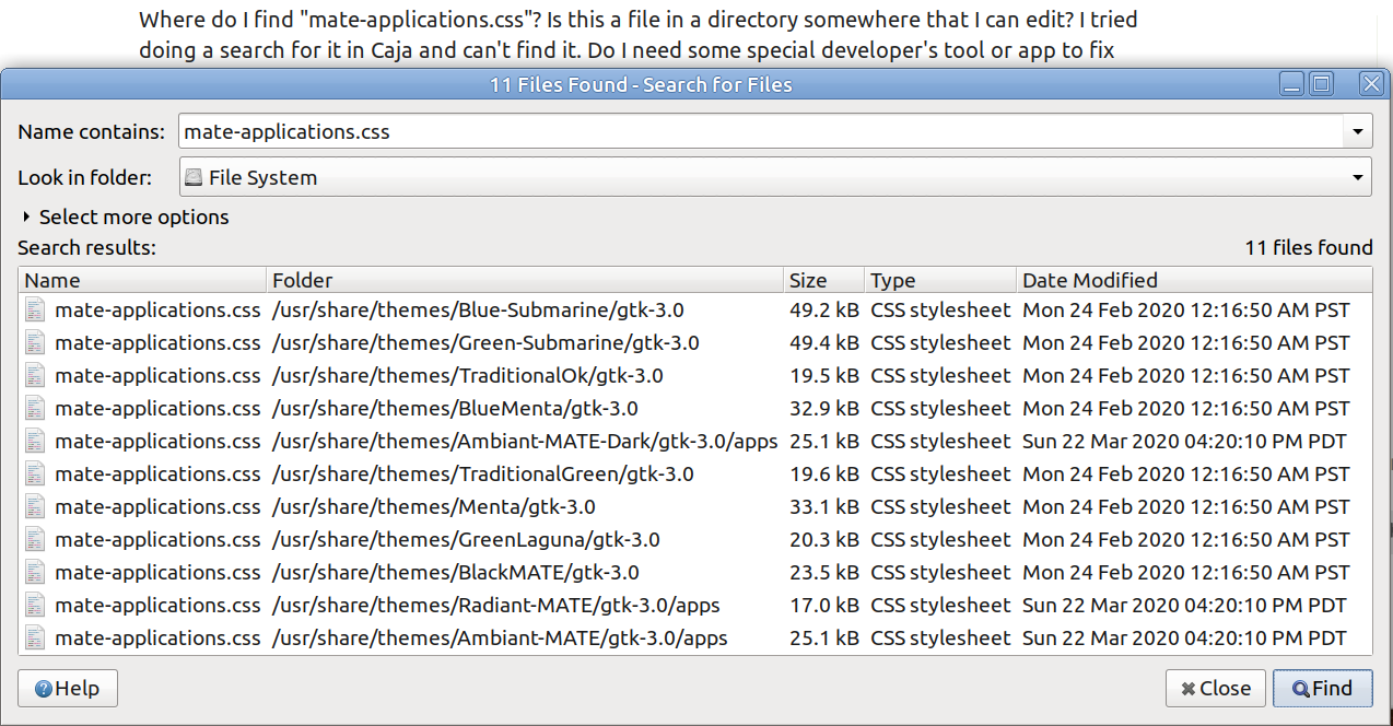
Where do I find "mate-applications.css"? Is this a file in a directory somewhere that I can edit? I tried doing a search for it in Caja and can't find it. Do I need some special developer's tool or app to fix this?
What is with all the bugs and changes from 16.04 (and lack of all the software that was available for 16.04)? I thought the whole idea of MATE was to preserve a "simple, light-weight, traditional desktop"... is MATE moving away from that philosophy? The Marco compositor is garbage... so many glitches in apps like VLC and other apps with OSDs. And Marco made my old machine run SLOOOW and hang a lot... already had to disable Marco and install Compton just to get my machine running smoothly again! What is happening to MATE?
For now, can someone please tell me how to fix this spacing Caja?
Thanks.
I wouldn't go so far as to say that Marco is "garbage", but it clearly doesn't work for anything but a tiny fraction of users (I suspect "people with nvidia cards"), whereas Compton works reliably for absolutely everybody.
re: the bugfixed CSS, I've updated my theme for 20.04 (which OF COURSE broken even MORE stuff at random), and may make more sense for you than trying to update the CSS files yourself.
FTR, I convinced Wolfgang Ulbrich to work around this issue for the Menta family of themes but this was unfortunately not worked around for the Traditional themes. See https://github.com/mate-desktop/mate-themes/issues/274 for more details.
The fixes are already documented in these forums, I think, and I'm happy to provide my updated "Traditional" theme to anyone who wants it - I just don't have the time and patience ATM to slog through getting someone to actually merge it into the base image.