Gnome3 and Unity have gotten one thing very, very right. They try and utilize the horizontal space for their launchers. When we transitioned to widescreen monitors, it no longer made sense to have all that stuff utilizing the top and bottom of the screens... eating up the smallest screen dimensions with static tool bars.
Auto-Hide isn't really an option for my tastes, at least on my main window control element, as I like to see what is up and running at a glance. I think after much trial and error I've finally got my setup how I like it.
Plank, fully extended on the left side of the screen and fitted with a custom "Show/Unshow Desktop" clicker, handles all my windows management functions. I have a small MATE panel set to auto-hide up top that has my system tray, clock and MATE Menu launcher it it, so Super_L can still get me a quick search box for apps that aren't on Plank.
I don't actually use multiple virtual desktops or Compiz at this point... someone linked me to a tweak to get tear free video under Marco a while back, so I left the sometimes wonky world of Compiz behind, pretty as it is
Anyway... everyone has their own way of doing things, but this one is mine. I think I've found my personal sweet spot.
NIce. For a while I ran XFCE strictly because of the deskbar option in the panel. At this point I’ve just adjusted to using a single panel at the top. On a 1080 screen it’s not as much a problem as it was on a 1366x768 display. Plus, with larger resolutions I was starting to have some RSI problems with my mouse wrist.
Absolutely... this cheap laptop monitor on my cheap Toshiba means I run apps full screen for the most part. I might have to swap it up when I get a new machine this summer (Broadwell based Intel NUC running a >22" display).
I have to say, the idea of a large panel (22+) with something like a Nuc utilising the vesa mount on the back sounds like it would be a lot of fun to have around.
I like your configuration of your desktop! Because your plank-setting, I realized, that it is possible to remove the fixed plank-own-button on the left side (that with the anchor). Actually very simple, but I had to know it, grab and let it go…life is learning!
I really like the left-hand panel layout stretched to the hight of the window. Under OS X that’s what I do with the dock but have never got it to play nicely with the top panel in Mate.
Looks like I’m spending today playing around with Plank!
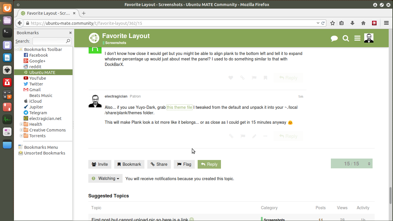
I don’t know how close it would get but you might be able to align plank to the bottom left and tell it to expand whatever percentage up would just about meet the panel? I used to do something similar to that with DockBarX.
Also... if you use Yuyo-Dark, grab this theme file I tweaked from the default and unpack it into your ~./local/share/plank/themes folder.
This will make Plank look a lot more like it belongs... or as close as I could get in 15 minutes anyway
Edit: I thought about rounding off the "top" edge Plank so it would match the rounded corners on Yuyo, but decided against it. It looks more like the normal panel that way.
@CGB did you mean you figured out how to make Plank and the MATE panel play nice together so that Plank honors the panels reserved space? If so, fess it up please!
@electragician no I didn’t but then I haven’t really dug into to the config files yet. I played around with your layout (using the same compact top panel) on my work machine for a while but am back to my go-to layout now for just a top panel with - from left to right: Mate Menu, Quick Launchers, Windows, Indicators and the Clock