I've been spectating the pull request from afar - thank you for working on improving this!
I think there's two visual concepts being mixing up in those reviews - I know the combine/linked style button look can certainly be influenced by the theme. Ambiant-MATE (our default) doesn't make them "stick" together anywhere:
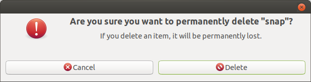
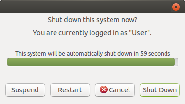
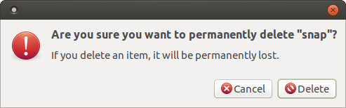
Presumably, the first two screenshots are using GtkMessageBox, causing buttons to stretch and space out to the full width of the window, as well as the center text alignment (yuck...). Definitely can see how GTK3 is influenced by GNOME 3's design guidelines there.
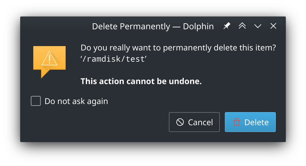
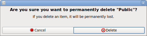
Whereas the third screenshot is closer to GTK2's traditional placement by placing buttons on the far right, similar to how Qt/KDE (and Windows/macOS) continues today and GTK2 did back then:
Please stop posting FAKE-NEWS under my name!
I never told you to add a deprecated function.
Only Mr. Trump is allowed to post fake news
Again,
Adding the .linked style class to GtkButtonBox , which is the parent of the buttons, with gtk_style_context_add_class isn't deprecated.
That means themes like MATE default Menta or gtk default Adwaita use the .linked button style.
Other gtk themes like Mate-Ubuntu themes doesn't use that settings in their gtk-widget.css.
Sorry everyone -- I had to close that pull request. I never was super gung-ho about the addition, and if @raveit65 doesn't really want it, then frankly I think it's not worth pushing forward on this. I'm also already adding more gray hair to my (already slightly graying) head.
So sorry but I hope everyone can live without this change a little longer.
Are there plans to tackle GTK4 or let MATE ride into the sunset on the GTK3 horse?
It seems GTK devs broke the future for traditional GTK desktops.
MATE will be appreciated as long as it is around. Thanks for the work you do.
I guess I've regained some of my colored hair, so I'll return to the "good fight" (TM) and resume (trying to) figure out what @56tievar is talking about.
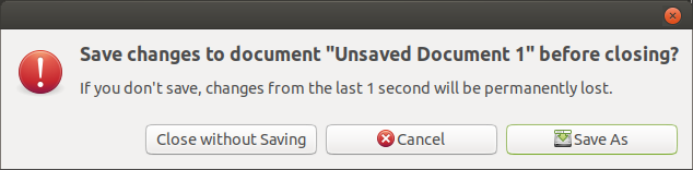
By the way, how did you get the icon next to the first dialog in your post there? It seems to be GTK+ 3, and that dialog is indeed powered by GtkMessageDialog, and GtkMessageDialog actually lacks any code to display icons (I'm pretty sure). I was unable to replicate that dialog appearance using my stock MATE and GTK:
Are you using gtk-mushrooms or something? Just curious.
Nothing special, it's the default in Ubuntu MATE. I genuinely don't know if it's a setting or something patched at distro level. A quick look in dconf/gconf editor didn't reveal anything. Doesn't seem to be an icon/theme thing either.
Which distro and version are you using?
I no longer use MATE myself, but I do have gtk-mushrooms (AUR) installed which did restored the dialogs for those few GTK applications.
I wish I could use Ubuntu MATE, but I only rarely can use it, as most of my machines are 32-bit capable only. As such I use (hopefully) Ubuntu MATE's closest relative, Debian, most of the time, and Debian is the system I was using when I took that screenshot. For whatever it's worth, I use Debian 10.6 (Buster) because Bullseye isn't stable yet, and also because of some LibreOffice GTK+ 2 foibles. Thus the MATE version I have is 1.20.4 and the GTK version is 3.24.5.
Weird. I guess the Debian version of GTK or Caja is not the same as the Ubuntu / Ubuntu MATE version -- most likely Caja was patched, because no icon appears next to the Log Out dialog anymore no matter what, and the Log Out dialog always uses GtkMessageDialog too.
OK. I guess it goes without saying that Ubuntu MATE is not based on Debian 10 -- if anything it's probably closer to Debian 11, at least in terms of package versions. But Gentoo, which ships with the newer MATE 1.24 and GTK 3.24.22, also displays the Caja prompt without an icon. Odd.
But first gets the progress bar's allocation->width.
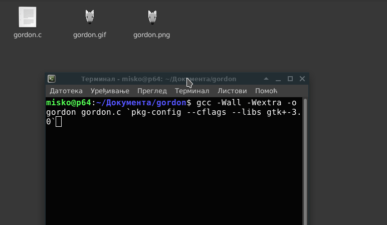
I don't know how to make animations from images, (probably can but looks like too much work) so I uploaded gordon.png to one website that creates animated gif from static image. https://www.kapwing.com/studio/editor
It's been nearly 2 years since this topic was created, and now I maintain a series of patches called gtk3-classic ... previously known as gtk3-mushrooms.
Even though my C isn't great, I have managed a couple of fixes - including the ability to scroll over tabs like we could do in GTK2.
It is packaged for Arch (which is pretty straight forward, actually), but I haven't forgot about Ubuntu MATE! At some point I will have another go at creating a PPA / Debian package so you can enjoy classic features of GTK2 in GTK3. I just need to figure out how to "turn off" tests for the Ubuntu gtk+3.0 package.
I think patching GTK3's quirks is a good workaround until STLWRT enters the scene as a possible GTK "slot in" replacement.
In other news: most GNOME apps and any app that uses the new libadwaita library will force the Adwaita theme. I hope people are getting ready to fork every GNOME app that wasn't already forked.
I've installed this and I like what there is of it that I've seen a difference to.
My question though is this just reverting back to earlier versions of GTK3 or does this show a way forward for the distro to be able to keep its distinctiveness while still being up to date on the latest GTK?
Technically, it's a collection of patches on top of the same GTK3 package made for that Ubuntu release. Those patches add or change bits of code to provide what we liked from earlier versions.
21.10 & 22.04 use GTK 3.24.30 whereas 20.04 LTS provides GTK 3.24.20. Due to differences in GTK3's code, a couple of patches can't apply correctly so there hasn't been officially any build for 20.04 yet.
I'm not sure if Ubuntu MATE could be officially allowed to promote this patched classic idea of GTK+3, being an official flavour; PPA implications and such. At best, I suppose there could be a button in the Welcome application, like there is for ubuntu-mate-colours.
There's also the fact this is entirely unsupported. If something breaks, you keep the broken pieces. Upstream projects everywhere shouldn't care about a modified build of GTK+3, so users should not pester issue trackers over bugs caused by one of these patches.
I've enabled the Discussions tab for gtk3-classic -- sort of like a subcommunity on GitHub for those who cherish the classic / traditional desktop:
There's probably more of us out there outside of this topic who ain't users of Ubuntu or MATE. Pretty sure a guy using FreeBSD makes use of these patches too!


 )
)
