save this as HoverlayScrollbars.patch in you home directory:
diff -Naur /usr/share/themes/Ambiant-MATE/gtk-2.0/apps/panel.rc /usr/share/themes/Ambiant-MATE-HoverlayScrollbars/gtk-2.0/apps/panel.rc
--- /usr/share/themes/Ambiant-MATE/gtk-2.0/apps/panel.rc	2017-08-18 19:09:03.000000000 +0500
+++ /usr/share/themes/Ambiant-MATE-HoverlayScrollbars/gtk-2.0/apps/panel.rc	2018-04-30 18:16:32.714100325 +0500
@@ -26,4 +26,4 @@
 widget_class "*notif*"            style "panel"
 widget_class "*PanelApplet*"      style "panel_default"	# workaround for right click menu corrupted bg
 widget_class "*Tray*"             style "panel"		# workaround for StarDict, gnubiff... tray icon bg
-class "GtkScrollbar"              style "murrine-scrollbar"
+class "GtkScrollbar"              style "scrollbar"
diff -Naur /usr/share/themes/Ambiant-MATE/gtk-2.0/gtkrc /usr/share/themes/Ambiant-MATE-HoverlayScrollbars/gtk-2.0/gtkrc
--- /usr/share/themes/Ambiant-MATE/gtk-2.0/gtkrc	2017-08-22 17:29:10.000000000 +0500
+++ /usr/share/themes/Ambiant-MATE-HoverlayScrollbars/gtk-2.0/gtkrc	2018-04-30 17:24:27.616872008 +0500
@@ -30,12 +30,10 @@
 	GtkScale::slider-length = 14
 	GtkScale::trough-side-details = 1

-	GtkScrollbar	::has-backward-stepper		= 1
-	GtkScrollbar	::has-forward-stepper		= 1
-	GtkScrollbar	::min-slider-length		= 15
-	GtkScrollbar	::slider-width			= 14
-	GtkScrollbar	::trough-border			= 0
-	GtkScrollbar	::activate-slider		= 1
+	GtkScrollbar::activate-slider = 1
+	GtkScrollbar::trough-border = 0
+	GtkScrollbar::slider-width = 13
+	GtkScrollbar::min-slider-length = 31

 	GtkScrolledWindow ::scrollbar-spacing		= 0
 	GtkScrolledWindow ::scrollbars-within-bevel	= 0
@@ -120,7 +118,7 @@
 		focusstyle = 3
 		handlestyle = 1
 		sliderstyle = 3
-		scrollbarstyle = 0
+		scrollbarstyle = 2
 		stepperstyle = 3
 		toolbarstyle = 2     # 0 = flat, 1 = glassy, 2 = gradient
 		#rgba = TRUE
@@ -212,20 +210,42 @@
 	}
 }

-style "murrine-scrollbar" {
-	bg[NORMAL]	= shade (0.99, @selected_bg_color)
-	bg[SELECTED]	= shade (1.03, @selected_bg_color)
-	bg[ACTIVE]	= shade (1.03, @selected_bg_color)
-	bg[PRELIGHT]	= shade (1.03, @selected_bg_color)
+style "scrollbar" = "button" {
+	xthickness = 2
+	ythickness = 2

-	engine "murrine" {
-		roundness	= 0
-		gradient_shades = {1.0, 1.0, 1.0, 1.0}
-		border_shades	= {1.05, 1.05}
-		contrast	= 0.4
+	bg[NORMAL] = @bg_color
+	bg[PRELIGHT] = shade (1.04, @bg_color)
+
+	bg[ACTIVE] = shade (0.96, @bg_color)
+
+	engine "murrine"
+	{
+		border_shades = {0.95, 0.90}
+		roundness = 20
+		contrast = 1.0
+		trough_shades = {0.92, 0.98}
+		lightborder_shade = 1.3
+		glowstyle = 5
+		glow_shade = 1.02
+		gradient_shades = {1.2, 1.0, 1.0, 0.86}
+		trough_border_shades = {0.9, 0.98}
 	}
 }

+style "hscrollbar" {
+}
+
+style "vscrollbar" {
+}
+
+style "overlay_scrollbar"
+{
+	bg[SELECTED] = shade (1.0, @selected_bg_color)
+	bg[INSENSITIVE] = shade (0.85, @bg_color)
+	bg[ACTIVE] = shade (0.6, @bg_color)
+}
+
 style "scale" = "button" {
 	bg[NORMAL] = @bg_color
 	bg[PRELIGHT] = shade (1.06, @bg_color)
@@ -688,9 +708,9 @@
 class "GtkScale" style "scale"
 class "GtkVScale" style "vscale"
 class "GtkHScale" style "hscale"
-class "GtkScrollbar"	style "murrine-scrollbar"
-class "GtkVScrollbar"	style "murrine-scrollbar"
-class "GtkHScrollbar"	style "murrine-scrollbar"
+class "GtkScrollbar" style "scrollbar"
+class "GtkHScrollbar" style "hscrollbar"
+class "GtkVScrollbar" style "vscrollbar"
 class "GtkCalendar" style "calendar"
 class "GtkInfoBar" style "infobar"
 class "GtkIconView" style "iconview"
@@ -750,6 +770,10 @@
 widget_class "*.<GtkList>.<GtkButton>.*<GtkLabel>" style "treeview_header"
 widget_class "*.<GtkCList>.<GtkButton>.*<GtkLabel>" style "treeview_header"

+# Overlay scrollbar
+widget_class "*<OsScrollbar>" style "overlay_scrollbar"
+widget_class "*<OsThumb>" style "overlay_scrollbar"
+
 # The window of the tooltip is called "gtk-tooltip"
 ##################################################################
 # FIXME:
diff -Naur /usr/share/themes/Ambiant-MATE/gtk-3.0/apps/gnome-terminal.css /usr/share/themes/Ambiant-MATE-HoverlayScrollbars/gtk-3.0/apps/gnome-terminal.css
--- /usr/share/themes/Ambiant-MATE/gtk-3.0/apps/gnome-terminal.css	2017-08-18 19:09:03.000000000 +0500
+++ /usr/share/themes/Ambiant-MATE-HoverlayScrollbars/gtk-3.0/apps/gnome-terminal.css	2018-04-30 01:32:30.540488120 +0500
@@ -5,3 +5,9 @@
     background-color: @dark_bg_color;
     color: @dark_fg_color;
 }
+
+terminal-screen-container scrollbar:hover,
+terminal-screen-container scrollbar:active {
+    background-color: alpha(@scrollbar_track_color, 0.4);
+    border-radius: 1px;
+}
diff -Naur /usr/share/themes/Ambiant-MATE/gtk-3.0/apps/mate-applications.css /usr/share/themes/Ambiant-MATE-HoverlayScrollbars/gtk-3.0/apps/mate-applications.css
--- /usr/share/themes/Ambiant-MATE/gtk-3.0/apps/mate-applications.css	2018-04-04 13:04:11.000000000 +0500
+++ /usr/share/themes/Ambiant-MATE-HoverlayScrollbars/gtk-3.0/apps/mate-applications.css	2018-04-29 23:43:13.245342962 +0500
@@ -484,6 +484,7 @@
     border-width: 0px 0px 0px 0px;
 }

+/*
 #mate-menu.background scrollbar {
     background-image: none;
     border-style: solid;
@@ -514,6 +515,7 @@
     background-color: transparent;
     color: shade (@insensitive_fg_color, 0.6);
 }
+*/

 #mate-menu.background entry {
     background-color: transparent;
@@ -701,6 +703,7 @@
     background: none;
 }

+/*
 .background.brisk-menu scrollbar {
     background-image: none;
     border-style: solid;
@@ -740,6 +743,7 @@
 .background.brisk-menu scrollbar.vertical .button.down:hover {
     box-shadow: inset 0 1px shade(@dark_fg_color, 0.35);
 }
+*/

 .background.brisk-menu entry {
     background-color: transparent;
diff -Naur /usr/share/themes/Ambiant-MATE/gtk-3.0/gtk-main.css /usr/share/themes/Ambiant-MATE-HoverlayScrollbars/gtk-3.0/gtk-main.css
--- /usr/share/themes/Ambiant-MATE/gtk-3.0/gtk-main.css	2018-03-19 14:26:40.000000000 +0500
+++ /usr/share/themes/Ambiant-MATE-HoverlayScrollbars/gtk-3.0/gtk-main.css	2018-04-30 19:01:43.082749066 +0500
@@ -157,12 +157,6 @@

 @define-color scrollbar_track_color mix(@base_color, black, 0.1); /* #e6e6e6 */

-@define-color scrollbar_trough shade(@theme_bg_color, 0.98);
-@define-color scrollbar_slider @theme_bg_color;
-
-@define-color scrollbar_slider_bg_color shade(@theme_selected_bg_color, 0.99);
-@define-color scrollbar_slider_hover_bg_color shade(@theme_selected_bg_color, 1.03);
-
 @define-color progressbar_fill_a shade(@theme_selected_bg_color, 1.07);
 @define-color progressbar_fill_b shade(mix(@theme_selected_bg_color, green, 0.10), 0.91);
 @define-color button_border_active shade(@theme_selected_bg_color, 0.95);
diff -Naur /usr/share/themes/Ambiant-MATE/gtk-3.0/gtk-widgets-assets.css /usr/share/themes/Ambiant-MATE-HoverlayScrollbars/gtk-3.0/gtk-widgets-assets.css
--- /usr/share/themes/Ambiant-MATE/gtk-3.0/gtk-widgets-assets.css	2017-08-18 19:09:03.000000000 +0500
+++ /usr/share/themes/Ambiant-MATE-HoverlayScrollbars/gtk-3.0/gtk-widgets-assets.css	2018-04-30 18:48:32.097615497 +0500
@@ -699,27 +699,3 @@
     background-image: url("assets/slider-right-backdrop-disabled.png");
 }*/

-/*************
- * scrollbar *
- *************/
-
-scrollbar.vertical button.up,
-scrollbar.vertical .button.up {
-    -gtk-icon-source: -gtk-icontheme("pan-up-symbolic");
-}
-
-scrollbar.vertical button.down,
-scrollbar.vertical .button.down {
-    -gtk-icon-source: -gtk-icontheme("pan-down-symbolic");
-}
-
-scrollbar.horizontal button.up,
-scrollbar.horizontal .button.up {
-    -gtk-icon-source: -gtk-icontheme("pan-start-symbolic");
-}
-
-scrollbar.horizontal button.down,
-scrollbar.horizontal .button.down {
-    -gtk-icon-source: -gtk-icontheme("pan-end-symbolic");
-}
-
diff -Naur /usr/share/themes/Ambiant-MATE/gtk-3.0/gtk-widgets.css /usr/share/themes/Ambiant-MATE-HoverlayScrollbars/gtk-3.0/gtk-widgets.css
--- /usr/share/themes/Ambiant-MATE/gtk-3.0/gtk-widgets.css	2018-04-04 02:30:05.000000000 +0500
+++ /usr/share/themes/Ambiant-MATE-HoverlayScrollbars/gtk-3.0/gtk-widgets.css	2018-04-30 19:03:23.010866182 +0500
@@ -909,10 +909,33 @@
   background: none;
 }

-.frame.flat,
+notebook.frame {
+    border: none;
+}
+
+/* XXX: this is a copy of the above; adding notebook.frame stack there didn't
+ * work */
+frame border, notebook.frame > stack {
+    border-radius: 3px;
+    border-width: 1px;
+    border-style: solid;
+    border-color: shade (@bg_color, 0.82);
+    border-image: none;
+    background: none;
+}
+
 frame > border.flat,
-overlay > frame > border {
-  border: none;
+.frame.flat {
+    border: none;
+}
+
+scrolledwindow > viewport.frame,
+frame > box > stack > scrolledwindow {
+    border-style: none;
+}
+
+frame > box.vertical > scrolledwindow.frame {
+    border-width: 1px 0px 1px 0px;
 }

 /***********************
@@ -2397,187 +2420,139 @@
  * scrollbar *
  *************/

+.scrollbar,
 scrollbar {
-    background-image: none;
-    border-style: solid;
-    border-color: @borders;
-    -GtkScrollbar-has-backward-stepper: true;
-    -GtkScrollbar-has-forward-stepper: true;
+    -GtkScrollbar-has-backward-stepper: 0;
+    -GtkScrollbar-has-forward-stepper: 0;
 }

-scrollbar.vertical {
-    border-width: 0px 0px 0px 1px;
-    min-width: 13px;
+scrollbar slider {
+    background-color: @scrollbar_track_color;
 }

-scrollbar.horizontal {
-    border-width: 1px 0px 0px 0px;
-    min-height: 13px;
+.scrollbar.vertical slider,
+scrollbar.vertical slider {
+    min-height: 25px;
+    min-width: 5px;
 }

-/* broken firefox ignore background of trough */
-scrollbar.vertical {
-    background-image: linear-gradient(to right,
-                                      @scrollbar_trough,
-                                      shade (@scrollbar_trough, 1.08));
+.scrollbar.horizontal.slider,
+scrollbar.horizontal slider {
+    min-width: 25px;
+    min-height: 5px;
 }

-scrollbar.horizontal {
-    background-image: linear-gradient(to bottom,
-                                      @scrollbar_trough,
-                                      shade (@scrollbar_trough, 1.08));
-}
-
-scrollbar trough {
-    border-style: none;
-    border-radius: 0;
-    border-image: none;
+.scrollbar.vertical.slider:hover,
+scrollbar.vertical:hover slider {
+    min-width: 10px;
 }

-scrollbar trough.vertical {
-    min-width: 13px;
-    background-image: linear-gradient(to right,
-                                      @scrollbar_trough,
-                                      shade (@scrollbar_trough, 1.08));
+.scrollbar.horizontal.slider:hover,
+scrollbar.horizontal:hover slider {
+    min-height: 10px;
 }

-scrollbar trough.horizontal {
-    min-height: 13px;
-    background-image: linear-gradient(to bottom,
-                                      @scrollbar_trough,
-                                      shade (@scrollbar_trough, 1.08));
+.scrollbar.contents,
+scrollbar contents {
+    background-color: transparent;
+    background-image: none;
+    background-size: 0;
+    border: none;
+    border-radius: 0;
 }

-/* Buttons */
-scrollbar.vertical button,
-scrollbar.vertical .button {
-    min-width:13px;
-    min-height: 16px;
-    padding: 1px 0px;
+.scrollbar.trough,
+scrollbar trough {
+    background-image: none;
+    border: none;
 }

-scrollbar.horizontal button,
-scrollbar.horizontal .button {
-    min-width:16px;
-    min-height: 13px;
-    padding: 0px 1px;
-}
-
-scrollbar button,
-scrollbar button:hover,
-scrollbar button:hover:active,
-scrollbar button:disabled,
-scrollbar .button,
-scrollbar .button:hover,
-scrollbar .button:hover:active,
-scrollbar .button:disabled {
-    border-style: none;
-    border-image: none;
-    border-radius: 0;
-    background-image: none;
-    background-color: transparent;
+.scrollbar:hover:backdrop,
+.scrollbar.dragging:backdrop,
+scrollbar:hover:backdrop,
+scrollbar.dragging:backdrop {
+    background-color: @backdrop_selected_bg_color;
 }

-scrollbar button:hover:active,
-scrollbar .button:hover:active {
-    background-color: alpha(shade(@scrollbar_trough, 0.8), 0.5);
+/* Adding margins, so actual visible size is: width - margin this allows to
+ * keep the slider smaller, but keeping few threshold pixels
+ */
+.scrollbar.vertical:hover:dir(ltr),
+.scrollbar.vertical:active:dir(ltr),
+scrollbar.vertical:hover:dir(ltr),
+scrollbar.vertical:active:dir(ltr) {
+    margin-left: 2px;
 }

-scrollbar.vertical button.up,
-scrollbar.vertical .button.up,
-scrollbar.vertical button.up:hover,
-scrollbar.vertical .button.up:hover {
-    box-shadow: inset 0 -1px shade(mix(@scrollbar_slider, @scrollbar_trough, 0.6), 0.87);
+.scrollbar.vertical:hover:dir(rtl),
+.scrollbar.vertical:active:dir(rtl),
+scrollbar.vertical:hover:dir(rtl),
+scrollbar.vertical:active:dir(rtl) {
+    margin-right: 2px;
 }

-scrollbar.vertical button.down,
-scrollbar.vertical .button.down,
-scrollbar.vertical button.down:hover,
-scrollbar.vertical .button.down:hover {
-    box-shadow: inset 0 1px shade(mix(@scrollbar_slider, @scrollbar_trough, 0.6), 0.93);
+.scrollbar.horizontal:hover,
+.scrollbar.horizontal:active,
+scrollbar.horizontal:hover,
+scrollbar.horizontal:active {
+    margin-top: 2px;
 }

-scrollbar.horizontal button.up,
-scrollbar.horizontal .button.down,
-scrollbar.horizontal button.up:hover,
-scrollbar.horizontal .button.down:hover {
-    box-shadow: inset -1px 0 shade(mix(@scrollbar_slider, @scrollbar_trough, 0.6), 0.87);
+.scrollbar.slider,
+scrollbar slider {
+    background-color: alpha(@selected_bg_color, 0.8);
+    border-radius: 1px;
 }

-scrollbar.horizontal button.down,
-scrollbar.horizontal .button.down,
-scrollbar.horizontal button.down:hover,
-scrollbar.horizontal .button.down:hover {
-    box-shadow: inset 1px 0 shade(mix(@scrollbar_slider, @scrollbar_trough, 0.6), 0.93);
+.scrollbar.slider:hover,
+.scrollbar.slider:active,
+scrollbar slider:hover,
+scrollbar slider:active {
+    border-radius: 2px;
+    margin: 0;
 }

-scrollbar button,
-scrollbar .button,
-scrollbar button:hover,
-scrollbar .button:hover {
-    color: @theme_fg_color;
+/* Adding margins, so actual visible size is: -GtkRange-slider-width - margin
+ * this allows to define some kind of proximity effect also on mouse-enter
+ */
+.scrollbar.vertical:dir(ltr):not(:hover):not(.dragging),
+scrollbar.vertical:dir(ltr):not(:hover):not(.dragging) {
+    margin-left: 7px;
 }

-scrollbar button:disabled,
-scrollbar .button:disabled {
-    color: @insensitive_fg_color;
+.scrollbar.vertical:dir(rtl):not(:hover):not(.dragging),
+scrollbar.vertical:dir(rtl):not(:hover):not(.dragging) {
+    margin-right: 7px;
 }

-scrollbar button:hover:active,
-scrollbar .button:hover:active {
-    color: @theme_fg_color;
+.scrollbar.horizontal:not(:hover):not(.dragging),
+scrollbar.horizontal:not(:hover):not(.dragging) {
+    margin-top: 7px;
 }

-scrollbar.vertical slider,
-scrollbar.vertical .slider {
-    min-width: 13px;
-    min-height: 42px;
-    margin: 0px -1px 0px -1px;
-}
-
-scrollbar.horizontal slider,
-scrollbar.horizontal .slider {
-    min-width: 42px;
-    min-height: 14px;
-    margin: -1px 0px -1px 0px;
-}
-
-scrollbar slider,
-scrollbar .slider {
-    background-color: @scrollbar_slider_bg_color;
-    background-image: none;
-    border-radius: 0;
-    border-style: solid;
-    border-image: none;
-    border-color: shade(@scrollbar_slider_bg_color, 0.95);
-    border-width: 1px;
+.scrollbar.slider:hover,
+scrollbar slider:hover {
+    background-color: alpha(@selected_bg_color, 0.85);
 }

-scrollbar slider:hover,
-scrollbar .slider:hover {
-    background-color: @scrollbar_slider_hover_bg_color;
+.scrollbar.slider:active,
+scrollbar slider:active {
+    background-color: @selected_bg_color;
 }

-scrollbar slider:disabled,
-scrollbar .slider:disabled {
-    background-color: shade(@scrollbar_slider_bg_color, 0.85);
-    border-color: shade(@scrollbar_slider_bg_color, 0.75);
+.scrollbar.slider:backdrop,
+scrollbar slider:backdrop {
+    background-color: alpha(@backdrop_filling_bg, 0.8);
 }

-scrollbar.vertical.fine-tune slider:hover:active,
-scrollbar.vertical.fine-tune .slider:hover:active {
-    background-image: linear-gradient(to bottom,
-                                      shade(@scrollbar_slider_hover_bg_color, 1.00),
-                                      shade(@scrollbar_slider_bg_color, 0.94));
-    border-color: shade(@scrollbar_slider_bg_color, 0.95);
+.scrollbar.slider:hover:backdrop,
+scrollbar slider:hover:backdrop {
+    background-color: alpha(@backdrop_filling_bg, 0.85);
 }

-scrollbar.horizontal.fine-tune slider:hover:active,
-scrollbar.horizontal.fine-tune .slider:hover:active {
-    background-image: linear-gradient(to right,
-                                      shade(@scrollbar_slider_hover_bg_color, 1.00),
-                                      shade(@scrollbar_slider_bg_color, 0.94));
-    border-color: shade(@scrollbar_slider_bg_color, 0.95);
+.scrollbar.slider:active:backdrop,
+scrollbar slider:active:backdrop {
+    background-color: @backdrop_filling_bg;
 }

 /*******************
@@ -2585,10 +2560,11 @@
  *******************/
 .ubuntu-online-accounts.frame,
 scrolledwindow.frame {
-    border-top-color: shade (@bg_color, 0.84);
+    border-top-color: @borders;
     border-right-color: shade (@bg_color, 0.76);
     border-bottom-color: shade (@bg_color, 0.86);
     border-left-color: shade (@bg_color, 0.76);
+    border-width: 1px;
     border-radius: 0;
     border-style: solid;
 }
@@ -4020,6 +3996,7 @@
     background-color: @osd_view_bg;
 }

+/*
 .osd scrollbar trough.trough {
     background-color: @osd_scrollbar_trough;
 }
@@ -4035,6 +4012,7 @@
 .osd scrollbar trough.slider:active {
     background-color: @osd_scrollbar_slider_active;
 }
+*/

 .osd iconview.cell:selected,
 .osd iconview.cell:selected:focus {
diff -Naur /usr/share/themes/Ambiant-MATE/index.theme /usr/share/themes/Ambiant-MATE-HoverlayScrollbars/index.theme
--- /usr/share/themes/Ambiant-MATE/index.theme	2018-04-24 20:03:18.000000000 +0500
+++ /usr/share/themes/Ambiant-MATE-HoverlayScrollbars/index.theme	2018-04-29 23:48:27.129526169 +0500
@@ -1,13 +1,14 @@
 [Desktop Entry]
 Type=X-GNOME-Metatheme
-Name=Ambiant-MATE
-Comment=Ambiant MATE theme
+Name=Ambiant-MATE-HoverlayScrollbars
+Comment=Ambiant MATE with Hoverlay Scrollbars theme
 Encoding=UTF-8

 [X-GNOME-Metatheme]
-GtkTheme=Ambiant-MATE
-MetacityTheme=Ambiant-MATE
+GtkTheme=Ambiant-MATE-HoverlayScrollbars
+MetacityTheme=Ambiant-MATE-HoverlayScrollbars
 IconTheme=Ambiant-MATE
 CursorTheme=mate
 CursorSize=24
 ButtonLayout=menu:minimize,maximize,close
+X-Ubuntu-UseOverlayScrollbars=true
then run in the terminal:
sudo cp -r /usr/share/themes/Ambiant-MATE /usr/share/themes/Ambiant-MATE-HoverlayScrollbars
cd /usr/share/themes/Ambiant-MATE-HoverlayScrollbars/
sudo patch -p5 < ~/HoverlayScrollbars.patch
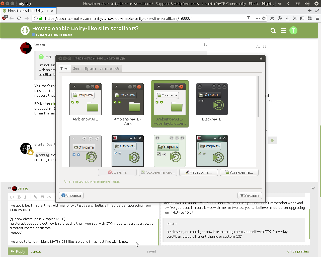
make sure you have overlay-scrollbar and overlay-scrollbar-gtk2 installed.
after that run mate-appearance-properties and select Ambiant-MATE-HoverlayScrollbars theme.