Hi,
'Dock' panel plugin has an older look & feel. It would need (IMHO):
- Modern look (for example as Mint or Budgie):
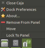
- Simple content menu: From nearest option from the mouse cursor: Close|Pin|Always on top:
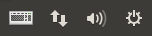
- If you set a big panel (in height), the systray has so big spaces between its icons:
Thanks in advance.
Hi Cold,
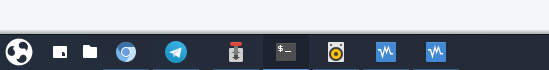
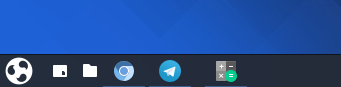
Your screenshot is a good example:
-
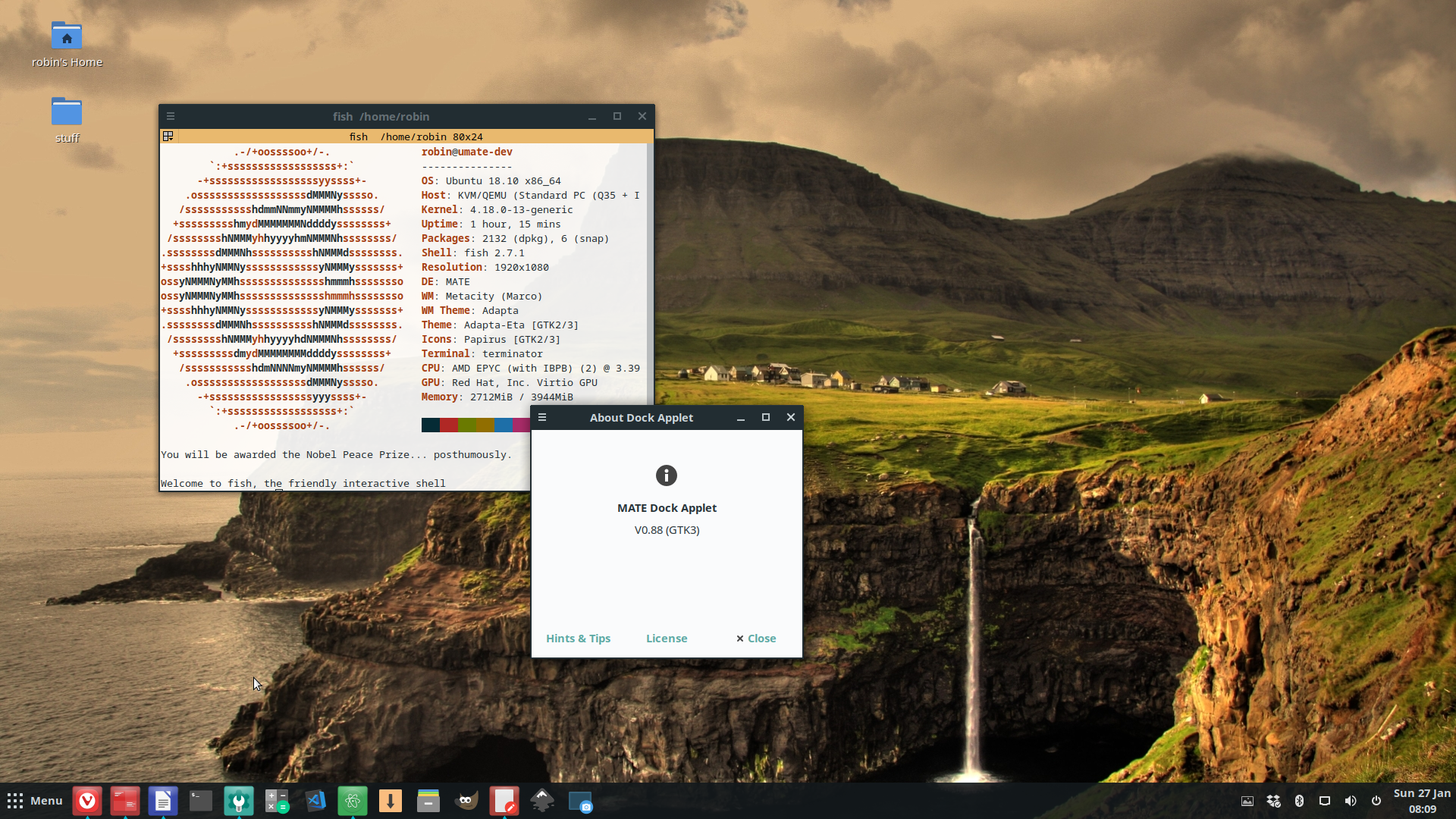
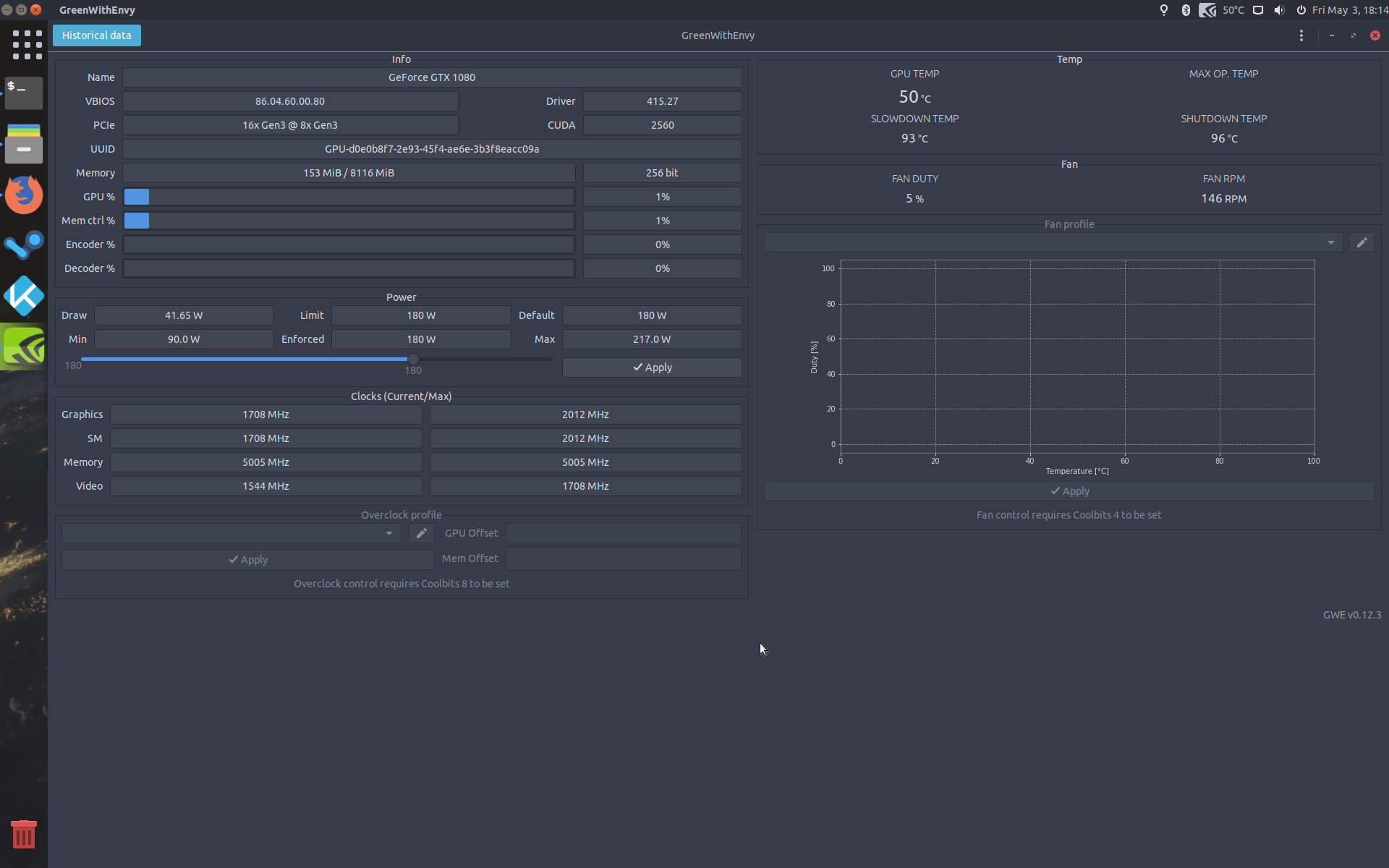
Just looking the dock, I don't know which program you're using in foreground.
-
Even I see several programs without a triangle under them, I suppose the programs without triangle are pinned. The pinned programs should be to the left as any other desktop environment.
-
Even the dock doesn't look so awesome as in Budgie or Mint:
I'm talking about a good dock  A dock for the year 2019.
A hug.
Sorry, been busy and couldn't be on my computer til now.
For the foreground one, the one with the color on the icon is the one that is on top, like here the program, GreenWithEnvy is the one on focus and has the icon with some color and the others with a triangle or whatever you chose on the settings.
Yep, those are pinned. Would be neat to move non active pinned programs to the side. You should ask if adding an option like that is possible on the developers github here.
Hug received. 
I love the dock, and I hate big icons. One MORE reason to love UM.