New default layout in Ubuntu MATE 18.04

It's that new icon to the left of the weather\clock\calendar applet.

I honestly don't mind the new menu it just shouldn't be where it is. If they need that to become a permanent part of the menu then the smart thing to do would be to change the Clock\Calendar to be an indicator and lock it to the left of the new system icon menu. (What is the name of that indicator any way?)

I went hunting for a indicator of that type and found the indicator-datetime but it seems to have a bunch of unity dependencies. Maybe future work could be to decouple it from unnecessary stuff like that and Evolution and it can be made to work as a part of the whole? If nothing else, it will provide a consistent look at least, one on par with what is expected from the Traditional look.

At this point if I get the name of the new indicator I plan on uninstalling it in favor of the old applet as soon as it's safe to do so. (No longer in Beta or RC.)

2 Likes

Excellent. It looks great, I’m looking forward to it.

I'm running a a different theme, but they are all the same. There is a invisible bar that if you right click on it will tell you the app name.

Why not just change the panel theme with MateTweak?

Because it’s not that simple…

Maybe this will help you understand what I mean:

The indicator-applet is a package deal for the most part.

You can remove the logout applet though.

sudo apt remove indicator-session

Conversely, I've followed the directions listed at the end of this thread in hopes of a more perfect theme.

Make Top Right Panel in Mutiny more like Unity?

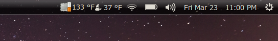
Despite all appearances this thread is actually about the indicators and the issue with the icon ordering which Wimpy explains in this post is something being worked on and is much more complicated than it might seem.

lah7 gives some nice instructions on how to make it work if you're willing to work for it.

That worked out quite well. Some nice instructions for this stuff on these forums, just a pity that it usually takes using Google to find it sometimes.

3 Likes

And I’m glad you found your answer. :wave:

1 Like

I’ll definitely not be the first to wonder about this. The thread I linked to was for 17.10 so people expect there to be things that are out of place because they’re being worked on and tested. On LTS releases people expect that to be done and over with.

If there’s not a reasonable way to place things in the right order it might be wise to simply put the transition on hold for the final release and rejoin when the dependencies have been decoupled and there is a way to do this without needing to edit with dconf-editor. Even then you’ll have those who will complain that the weather is no longer a part of the calendar\clock applet. Honestly I don’t like having to use weather report myself, I much rather have it work the old way. That said the new calendar is kind of neat and while some refinement is definitely preferred I can see it becoming a new default once the bugs and theming have been worked out.

Regardless of a way for individual users to fix things I must predict that this will be a common question coming up when 18.04 releases: ‘Where’s the shutdown button?’ followed by ‘Why can’t I move the button to the end?’ and so on.

Actually the more I look at it the busier it looks. I may just remove the applet you mentioned and put the Mate clock\weather\calendar back in…LOL…

1 Like

Simple counterpoint to what seems to be the upset over spilled milk sentiment here since I’m not recognizing anything remotely resembling breaking changes here.

The tech stack for Ubuntu is changing - alot.

Martin / UM team has kept up. Quite nicely I might add.

They want to entice more users so there is momentum and funding to continue to do so from said supporters. To not respond to that would actually be irresponsible for the UM team and Mr Wimpress.

By definition your obviously more conservative desires for the UM desktop are going to be diluted by the preferences of the new userbase. The fact that UM is clearly working quite definitively to preserve your preferred user experience and (exceedingly well I’d say by almost any measure) managing to do that and allow new users to come aboard and be happy with the experience is basically the topic of the day, and what the team is to be commended for. Literally as he said, you can restore the defaults quicker than you wrote this post.

Additionally, just as the other counterpoint, if they’d kept the traditional default menu and desktop metaphor (and not enabled Superkey function), I would specifically NOT use Ubuntu Mate because I don’t like the default metaphor or menu. I’m not a Gnome user from way back when, and thus that layout is neither familiar or desirable to me.

Another commenter mentioned bugginess for the Brisk Menu - if that’s the case then hey that’s valid criticism. I’ve not experienced it, but if it is present, I would second the motion to say that if it’s the default choice, it needs to be pretty close to bug free.

Thanks for the post - I think you were able to express yourself without being harsh or rude, but just wanted to point out that ensuring the best overall experience for his userbase (folks continuing to follow the parade leader) is in my opinion exactly what Martin has accomplished here. It’s a fine line to walk to be able to support a dual platform (x86 and ARM) userbase, folks with strong opinion about keeping the old traditional UI - and manage to be one of the more respected choices for all of the above, so hats off to the team and also to all of the behind the scenes general linux improvements to the community this project has both funded supported and otherwise dedicated resources to.

2 Likes

Again, I am compelled to reply to this. The problem, speaking only for myself, was not the layout change per se. It was:

  1. The change being made despite a consultation and poll that was carried out that showed the vast majority of users in that consultation and poll did not want the change, despite your assertion to the contrary.

  2. The change being made without informing users first. Now, I know that the change, initially, was in the beta and the usual repost is that is was merely “experimental”. Well, we know now that it was anything but “experimental” since it has since been implemented in the upcoming LTS. And, just to add insult to injury, the new Brisk layout was going to be called “traditional”, just to confuse the issue further.

  3. The change, having been initially implemented in the beta, did not still provide the original Traditional (Gnome-2-like) layout in Mate Tweak. To confuse things even further, the new layout was going to be a Frankenstein mixture of parts of the Traditional menu along with the Brisk menu. The only way, then, that users would be able to implement the original traditional menu layout would me to manually re-build it.

However, following the strong objections raised in the previous thread on this issue to all of the above, there has now been an entirely sensible arrangement arrived at;

Firstly, the Brisk menu will, indeed be the basis of the new default layout. But, it will not be called “Traditional” and will, instead, be called “Familiar”. Secondly, the original “Traditional” layout will be offered as one of the layout options in Mate Tweak. Thirdly, all layouts will be offered at initial login on the welcome screen.

All of which is entirely commendable and excellent.

None of which, I would contend, would have happened if significant objection in the previous thread had not occurred.

That, for me, is (or should be) the end of the matter.

But, I object to and will continue to object to, where I see it, a re-writing of events. A re-writing that can only be based on either ignorance of those events or on a disingenuous recounting of them

3 Likes

You are correct @stevecook172001

Perhaps the only good thing that came out of the poll is that the traditional layout is still included. If we all had not voted to keep it as the default, it may have been done away with all together, which may still happen someday.

2 Likes

however remember that poll was whether or not pantheon, I wouldn’t like pantheon though I would care,this is not pantheon there has been no poll between Familiar and traditional so one doesn’t know how the community would have voted, there would be many potential reasons to vote against pantheon but not familiar ie plank, HUD, one panel vs 2, workspace switcher placement, lack of window menu… I’m not against having either, but I see Martin’s logic behind the change and think it good, ie most windows users have used the super key for opening the menu

2 Likes

Again, this is muddled at best or disingenuous at worst. That poll was about whether or not to change the default main menu layout from Traditional. Users in that poll voted overwhelmingly for it not to change.

For you to attempt to make an argument along the lines of;

“but if they had been offered the Brisk menu… who knows if they might have voted for it. Therefore, we can ignore the result the poll…”

is akin to arguing;

"they might well have voted differently if they had been offered a million quid/threatened with bodily harm/insert your fantasy alternative reality here. Therefore, we can ignore the result of the poll…

Your argument is very similar to ones used by politicians to justify ignoring the electorate when the electorate votes in a way they do not like.

In conclusion, I have to say it is irritating me mightily to be having to come back on here and post these replies since the matter is now satisfactorily and fully resolved, by my estimation.

But, I will not stand by and see reality be re-written as something it was not.

2 Likes

Greetings.

For me, horizontal space is not a problem.
3 keys for Applications, Places, and system would be better because it does not postpone another selection process!

I really get irritated when the cancel and save buttons are not on the screen and there are no scrollbars.
so far, that is not a problem on the desktop menu.
Jay

Oh boy.

This is getting tiresome. Take a look at the poll steven linked. This question was asked and out of the seventy-one people who bothered to vote only 22.01 agreed with changing the default. That's what this has been about--defaults. Oh and lying or misdirection or even 'Hey we changed our minds and it's our ball--deal with it!' which ever one you prefer to call it when they snuck it in a daily and prevaricated when called on it by those of us who thought this was settled already.

And you know what? It's true. This is Wimpy's distro. He can do whatever he likes with it. He wants to veer even closer towards being a LinuxMint clone, that's his choice. It's not like the theme didn't clue us in long ago that this was the Ubuntu for people who wanted to use Mate but not LinuxMint's Mate.

I refuse however to be slandered. Or let people treat me like Jordan Peterson. ''So you're saying..." No, let me tell you what I'm saying.

Ubuntu-Mate was advertised as the Ubuntu Distro with the Mate desktop. The same desktop some of us have been enjoying for the last ten or more years that it's been available. It's the reason most of us are here. We liked the way Ubuntu's version of the Gnome 2.x desktop looked and behaved, it was familiar to us. This distro offered us that experience again out of the box. So we came back from where ever we had scattered to while Canonical frittered away money playing with Unity. Canonical could have started the Mate Desktop themselves--I wonder how much more would be using Ubuntu and Linux today if they had?

So after winning us over with one of the best desktop experiences in the world, what has Wimpy decided to do? He'd decided to shove us off into the corner for a mere 31% of his userbase in defiance of the clear majority of people who saw the poll and cared enough to vote in it. Let me remind you for the reason behind the change:

To me that says there is a bug that needs to be fixed to make the various layouts work better with each other and the upgrade process. Because unless that happens I guarantee that it will always be a non-trivial matter to migrate those settings. The result? Well look at the git:

We're going back to the dark ages it says. And the default layout that is the dark ages according to this? Ubuntu-Mate.

So yes, this is a big deal. Defaults always are. If it was not such a big deal, why not simply set it so every time the user logs in they get a different layout? It's all the same right?

I'm thrilled at the many different layouts. I think it's great to have so many options available. I just think they should remain options.

Eh? What about your options? You have literally every other distro under the sun, leave this one for the people who wanted it. Leave us this one. Why can't you make those simple adjustments? We were here first!

Otherwise don't be surprised if the "Tradition" of Ubuntu-Mate ends here. Out of sight means out of mind. Ask yourself why there is a focus on replacing the default layout rather than fixing it so that new layout settings can be added and migrated?

In any case I'm tired. I'm tired of being accused. I've not lied. I've sourced my statements previously in the thread. I'm tired of being accused of bad faith by people who just want new shineys. I repeat, if it's really so trivial and the community has made its thoughts known why can't you make the adjustment.

2 Likes

Yep. Spilled milk.

The position you’re staking out is the same corner Gnome has painted
themselves into and the same technological debt trap many a linux distro
has allowed themselves to fall into. Hope that you can find some peace
with it eventually.

Biggest in terms of numbers using, numbers downloading, or biggest in terms of money brought in?

And yet this user base seems to get the least attention? Raspberrypi ubuntu-mate has some serious flaws that regularly get reported on this forum. The next release for pi users will be in July I think?

Defaults are a matter of personal preference (personally I don’t like the brisk style menu, but the traditional menus have been a cluttered mess for a long time), but it is quite annoying that things like this are placed above fixing bugs. I can’t at the moment recommend people use Ubuntu-mate on the raspberry pi because a standard update of packages will break it.

1 Like

I would say numbers downloaded otherwise distrowatch could be a lot more accurate, though anyone’s guess at this point.

To be clear, I am satisfied with the changes as currently outlined (however, I am bound to say, I do believe those changes, as they are currently outlined, would not have occurred in the absence of significant objection to the initial changes).

I’m just not fine with being mis-characterised or with reality being re-framed

I don’t like dishonesty.

That’s it really.

Can’t wait until ubuntu MATE 18.04 LTS release with new standard panel layout. It’s a good choice and a step further in the great development of ubuntuMATE. To people I have shown ubuntuMATE the Brisk menu is preferred over the old style menu. Me myself use the contemporary panel layout, even more advanced and modern :slight_smile: Keep up the good work and the great direction ubuntuMATE is developing into.

2 Likes