New default layout in Ubuntu MATE 18.04

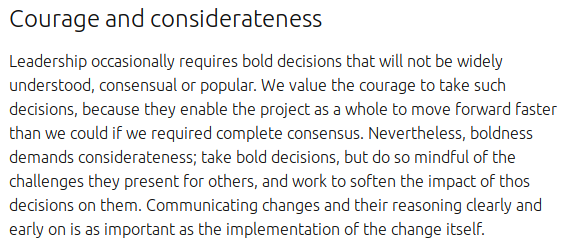
I have decided to add a new layout to the collection available in Ubuntu MATE 18.04. It will be called Familiar and is based on the Traditional layout with the menu-bar (Applications, Places, System) replaced by Brisk Menu. It looks like this:

Familiar will become the default layout for new installs of Ubuntu MATE 18.04. Traditional will continue to be shipped, unchanged, and will be available via MATE Tweak for those who prefer it.

I experimented with a change to the Traditional layout earlier in the 18.04 development cycle and this was met with some hostility and brought into question my commitment to community opinion because it strayed from something I'd previously communicated, that we would retain the Traditional layout as default.

The landscape has changed since we debated default layouts, Brisk Menu has improved considerably and Ubuntu MATE and MATE Desktop have made huge strides in supporting Super key and other modifiers as action keys just as you'd expect to use in main stream operating systems.

With the 18.04 LTS ahead of us I firmly believe that Ubuntu MATE has to put its best foot forward and present a default experience that exploits all the advancements we've made over the last 2 years, which includes migrating to GTK3, MATE HUD, uplifting all themes to support all GTK3 style classes, refinements in Ubuntu MATE Welcome and improvements in Software Boutique, Brisk Menu joining the MATE ecosystem, Indicators by default, hardware accelerated window manager compositing, super charging the file manager with many useful extensions, HiDPI support, proper global menu support, artwork and branding refreshes and hundreds of bug fixes.

I hope you all understand the rationale for this change and accept that this change, like any other, is being made for the betterment of Ubuntu MATE and appreciate that I have spent far longer carefully composing this post than the time it took to create the Familiar layout and make it default.
33 Likes

Bold move, Martin, and I applaud you for it. I personally don’t use the brisk menu, but I see how this can only benefit adoption of Ubuntu MATE.

Ultimately, new users haven’t formed a strong opinion, and veteran users already have their choices made that diverge from the defaults. Starting off your experience with something like Brisk as default will solidify the opinion of Ubuntu MATE being one of the most user-friendly distributions around.

9 Likes

I think that MATE is becoming the most versatile desktop of Ubuntu, although for me the best is the Mutiny layout.
my relatives need a simpler desktop on their computer, for this is why I install the default layout, then I add to the system the apps they need for optimal use.

It’s a good to leave the classic menu, because there are people who like it that way,

great job …

4 Likes

I think this is a good idea for first time users and for us old timers can easily change and customize it.

I enjoy using the brisk menu but i would like to be able to have an option to have Places in the menu.

:slight_smile:

4 Likes

So after everything, you’re still choosing to disregard the feedback you yourself solicited because it didn’t match up with what you were hoping the community would say?

Disappointing.

Sure, the traditional layout is there but for how long? And what breaks when you don’t do what the system expects you to have installed? One of the reasons I tested and disregarded SolusOS was because trying to use Mate without their Brisk menu caused issues with the overall theming and defaults. Now I get to look forward to that on Ubuntu-mate too? Great!

The deja vu here is way off the charts.

I don’t even understand the attraction to these BriskMenu, MintMenu, GnoMenu, etc. To me they just make the menu look messy and busy and worst of all they’re slow. I can use the traditional menu and go straight from applications to type to my actual application quickly and everything is laid out elegantly and orderly.

Really, more than anything else the menus were a large part of what brought me to Gnome 2.x after everything else because I saw that Gnome was doing for me what I’d been manually doing in my Windows start menu. Why is everyone so insistent on taking away the best parts of the Linux desktop?

Between compiz getting neutered more and more, almost every distro opting to ape Windows with ugly and busy application launch menus, and wholesale papercuts all over the place why does it feel like all the stuff that I liked keeps breaking or getting moved around?

4 Likes

Yes, looks like it is not a community-driven distro anymore.

2 Likes

Ubuntu MATE is community driven by the community members who contribute with code, artwork, bug triage, translations and crowd funding. Community discussions are a useful indicator of what everyone is looking for, but I’m allowed to change my mind. Especially when I strongly believe it is for the best.

Using Familiar by default exposes many new capabilities that the Ubuntu MATE crowd funding made possible. I think it would be a huge disservice to those people funding the development of new features to not present them in the default experience.

Given the Traditional layout is still available, and that you’re here reading this, you have no grounds for complaint. The layout you want is still available.

Brisk Menu is not slow. It is called Brisk Menu for a reason. If the are bugs in the Brisk Menu implementation in Ubuntu MATE please direct me to your bug reports. Compiz is still shipped in Ubuntu MATE and had seen active maintenance including support for MATE when running on HiDPI displays. Don’t make false assertions you can’t support.

If you’ve identified bugs please direct me to the bug reports.

21 Likes

Thank you @Wimpy ! Your leadership should be celebrated and applauded.

I joined this community a few years ago and have been pleased ever since! I try to contribute whenever I’m able and have something positive to offer.

Keep up the good work.

8 Likes

When your objectives include the words:

Recreate the halcyon days of Ubuntu for users who prefer a traditional desktop metaphor.

this leaves a certain expectation in those users who do prefer that traditional desktop metaphor. There's a reason why we flocked to this distribution in the first place. You were one of the few that actually offered the traditional desktop we were used to and had come to love. It wasn't Ubuntu's TV distro that made it famous, nor its Android on Linux moonshots, or its phone convergence--it was a desktop that worked intuitively and looked good in all the right places. It was its Gnome 2.x that they did better than everyone else that made Ubuntu.

Now you're trying to change that. Despite having done a poll and been told that most of us do not want. Despite having lied about this being only "experimental" in test builds and not actually planned to be forced as the _emphasized text_new default when we again said we did not want that.

Defaults matter. Every distro other than this one has given me fits when I tried to change the default stupid Windows knock off menus or panels by breaking, often in strange ways that defy description.

You say compiz is in the repos? I wonder why so many threads about it were necessary then...

Funny how all those people could have just installed the files from the repos and didn't for some reason...

Hey it's your distro. You're absolutely free to do what you want. You want to lead the parade, have at it---just be sure that where you're leading there are people following.

With how vocal many of us have been on this I would be surprised if the change doesn't have consequences once things start breaking and who knows? Maybe you'll be the first to get it right and you'll have your cake and be able to eat it too. There's always a first time.

I sincerely hope to be proven wrong when the release of 18.04 LTS comes out and continue to be proven wrong as the releases after that come out. I don't expect that I will be on this--but I sincerely hope I am. I like this distro, I like this desktop--for the most part it's just worked for me so I want it to continue doing so.

Please let me be wrong!

2 Likes

As one of the traditionalists I have no issue with this.

Personally, I find the Brisk Menu so dominated by the (useful) text search that it's horrible for keyboard navigating anything else on it. Since it sits as a perfect example of how keyboard navigation is being abandoned I can simply replace it. No problem.

BTW, I happen to be looking at panel layouts in Debian 9 Stretch with MATE 1.16.2 and it has only 2 selections on a basic install: Fedora and GNOME2. It struck me... that's great names for those! :slight_smile:

5 Likes

I applaud you Martin. You are making the right decision not listening to the vocal minority of complainers. The Brisk menu is a much much better default for the vast majority of users and those that don’t like it can switch to whichever layout they do like.

2 Likes

Always amazed how some people change a We in a Me. Putting themselves on the other side of a We in just a few bits of too much of a wee-bits of Me.
Focus the We on thee and you’ll find quite a lot of your Me into what should be We.

re Familiar vs Traditional
Another applause here.

3 Likes

Interesting choice.

I would first like to test how that look and works together before commenting about it. From the photo I’m missing Places (like it how there are more options there in traditional layout that were in 16.04.) Hopefully that can easily be changed trough.

Downloaded daily image earlier today and it doesn’t include that option yet. Also didn’t come with Welcome or Software Boutique, hope to see them back soon too.

Wonder why name it Familiar… Familiar to who? Not existing users that prefer traditional layout… To me it looks more Modern then Familiar, but maybe that’s just me.

I don’t mind more options, as long as things can be changed and customise to each users preferences.

1 Like

Thanks for the update @Wimpy .
I don't have a problem with this either.

To the ones complaining in this thread, please be aware that @wimpy's actions fall square within the guidelines of the Ubuntu Code Of Conduct:

7 Likes

@bornagainpenguin The menu is not what defines the desktop metaphor. The desktop, where you place icons and files, does that.

I’ve set out my rationale for making this change, no need to repeat myself.

You can only please most of the people most of the time. I am confident in my decision that this change, along with retaining the Traditional layout, is the right move. Judging by the feedback I’ve seen on the Ubuntu MATE social accounts, and here, most users commenting are happy to see this change too.

Your argument that a default is changing is weak since you know you can effortlessly restore the layout you prefer. I have no intention of removing the Traditional layout, there is no evidence to suggest I would. The number of layouts available in Ubuntu MATE continues to trend up.

You’re right, defaults matter and this is precisely why I’ve made this change. The lack of Super key launching by default is a regular criticism I see leveled against Ubuntu MATE and it hurts adoption IMO.

Not sure why you’re referring to posts about Compiz Fusion and Compiz Reloaded. Compiz 0.9 is shipped in Ubuntu MATE, offers first class MATE support and gtk-window-decorator provides seamless theme integration. You can even enable Compiz with a single click via MATE Tweak. The Compiz plugins absent from Compiz 0.9 are missing because they don’t offer OpenGL and EGL compatibility, if I we’re to provide them it would cause Compiz to fail on ARM architectures. ARM is our biggest user base BTW. Compiz 0.9 has been working a treat in Ubuntu MATE for three years on multiple architectures. I follow the Compiz Reloaded project closely and see no reason to switch at this time.

I think your pessimism is misplaced and I hope you’ll be a happy Ubuntu MATE 18.04 user with the Traditional layout :slight_smile:

5 Likes

I think “Default” would be a good name for the new layout.

3 Likes

Familiar because the two panel arrangement is retained with only the menu being changed. We already have a Contemporary layout and I felt Modern was too similar to distinguish them.

2 Likes

Off-topic, but this is interesting. I see a lot of Raspberry Pi posts, but I would not have guessed this. I'd be curious to see more stats.

I am using Brisk 0.5.0 on my “other machine” (Manjaro MATE) and, to be frank, am amazed at how buggy the Brisk keyboard navigation is, having always used Super+start typing until now.

Super then Tab gets into the right-hand pane, but there is no way to get into the left-hand pane and up arrow, down arrow and Tab sort of work to go up and down the list in the right-hand pane. In addition the menu has a tendency to become stuck in front of things …

I think I might put up some ÂŁ to encourage a fix. It would be great to be able to use Tab as now, all four arrow keys, Return to select and Esc to go back to the typing box.

(As someone with restricted shoulder movement, come to think of it, that would be a massive improvement).

1 Like

Thumbs up! :relaxed:
Hope the Brisk menu is available for the “Redmond” layout, too (the layout that has only ONE “toolbar”!).
Never understood why we need two “toolbars”… even if my display resolution is QHD / WQHD - 2560×1440 -, I am not happy “giving away” any pixels for an additional “toolbar”.

1 Like