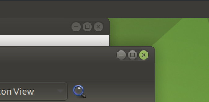
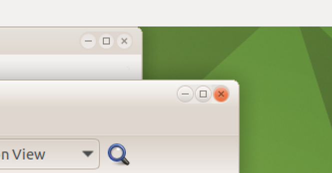
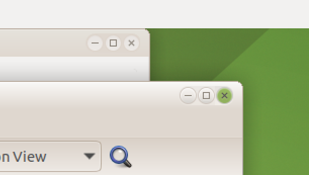
Even though Ambiant-MATE (the old theme) is unofficially supported now. What do users and lovers of this theme think about changing the close button from its long time orange to green by default?
Just a quick vote & thought here; I voted to keep it orange, as orange is pretty close to red which usually means "Stop! You're about to do something drastic!" - like "stopping"/closing the program currently in use. Whereas green typically means "Go!" and (an even brighter shade of green) would be great for the maximize button (Fullscreen = maximum "Go!"), and finally either yellow or blue for the minimize button.
When I'm working on such windows min/max/close buttons, I like to make the primary color shades a little subdued, and incorporate a much brighter shade on hover to act as a visual indicator that the cursor has found its target, as well as which particular target via the bright "pop" of color.
Although orange is similar to red, it doesn't fit in balance with the design of the operating system, and if we put the red button it would be horrendous, regardless of what the colours mean, I vote for green, which is in line with MATE.
 orange to
  green by default?
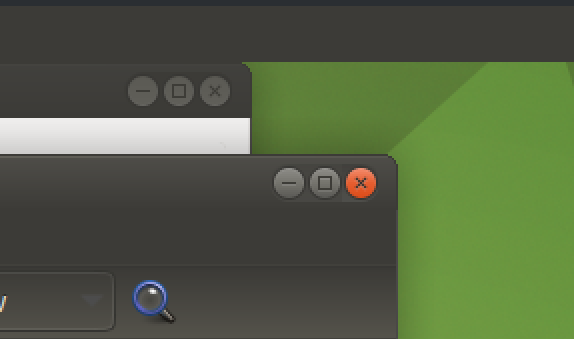
 Whereas green typically means "Go!"
  and (an even brighter shade of green) would be great for the maximize button (Fullscreen = maximum "Go!"), and finally either yellow or blue for the minimize button.