I am using ubuntu mate since long and have been using Traditional Mate theme since start. I have since quality improvements, especially in placing missing icons in the themes during my usage. However there are some issues that are quite jarring to the eye that still persist. I will list atleast two now and request someone to correct the anomaly:
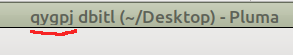
There is a problem with lower glyphs for letters such as 'pqjy' (red underline) in the title bar. Illustration
while the letters with upper such as 'dbitl' look fine the letter 'j' looks almost like an 'i'.
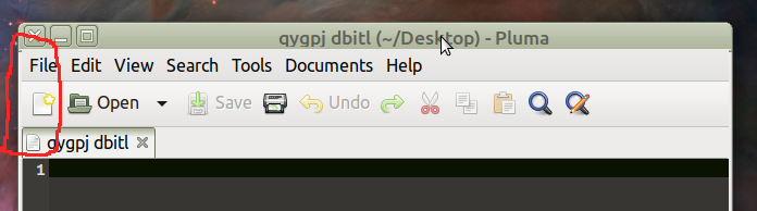
There is a discontinuity that is observed, between title bar and menu bar (red circle), when we un-maximize any window, which is quite observable. Illustration
this is noticeable in all application weather the window is un-maximizable or not. (for eg. you can un-maximize pluma whereas you cannot un-maximize user and group window but this discontinuity is observable in both.
I hope that i have used appropriate forum to bring it to your attention.
These bugs appeared sometime after 18.04, and I expect are the result of changes to the underlying GTK3 toolkit where the GNOME team "broke" various pieces there to make their theme work better rather than fixing their theme.
The second one can be fixed like this in "metacity-1/metacity-theme-1.xml" in the theme's folder:
    <aspect_ratio name="button" value="1.0"/>
    <distance name="title_vertical_pad" value="0"/>
-     <border name="title_border" left="2" right="2" top="4" bottom="3"/>
+<!-- as usual, gtk has randomly broken between versions
+for anything after 18.04, this needs to be this instead:
+       <border name="title_border" left="2" right="2" top="4" bottom="5"/>
+-->
The text clipping bug of the first one is something I haven't looked into yet.
I was one of the unofficial early testers of GTK 4. GTK 4 requires a lot of extremely cutting-edge dependencies; therefore I found myself installing some new dependencies as such. One such dependency is Pango; I had to install 1.47.0 to run GTK 4.0.0, for example.
I saw this bug on Gentoo with the MATE desktop about 5 months ago (right after I installed Pango 1.47.0), but thought it was my imagination. Then I noticed that when I typed text into Pluma, blank lines appeared shorter than lines containing any text, even spaces. Long story short, I reverted back to Pango 1.42.2 and everything rendered perfectly. I later found out that Pango 1.48.0 is masked in Gentoo since others noticed this glaring problem involving poor text dimensioning.
In other words, I'm not asking anybody to downgrade Pango necessarily; that could be a little risky if you don't know what you're doing. But I strongly suspect it's partly (or completely, frankly) a Pango problem. I think the newer Pango 1.44 also has the issue, which would explain why, say, 20.04 exhibits the problem but 18.04 does not.