For the "input" element in the below, I've tried to place the "autofocus" attribute
- in both the element itself, and
- in the CSS style definition,
and neither will apply the autofocus on the input field at popup.
Would someone be willing to explain why?
HTML file:
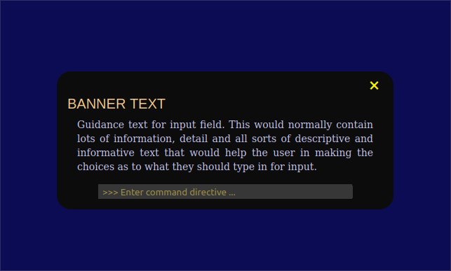
<!DOCTYPE html>
<html lang="en-CA">
<head>
<title>On-Load Popup Input Prompt</title>
<!--Stylesheets-->
<link rel="stylesheet" href="test.css" >
</head>
<body>
<div class="popup">
<!-- "close" button is offered only to abandon input when action is optional -->
<button id="button_close">×</button>
<!-- Title should describe tactical purpose for popup window -->
<div class="popup_banner">
BANNER TEXT
</div>
<div class="popup_guidance">
Guidance text for input field. This would normally contain lots of information, detail and all sorts of descriptive and informative text that would help the user in making the choices as to what they should type in for input.
</div>
<!-- Input widget segment -->
<div class="popup_getinput_text">
<input id="popup_input_text" type="text" placeholder=">>> Enter command directive ..." autocomplete="off" autofocus="true" >
</div>
</div>
<!-- Input action script segment-->
<script src="test.js"></script>
</body>
</html>
JavaScript file:
window.addEventListener("load", function(){
    setTimeout(
        function open(event){
            document.querySelector(".popup").style.display = "block" ;
        },
	// this value controls the delay before popup is displayed
        0
    )
} ) ;

document.querySelector("#button_close").addEventListener("click", function(){
    document.querySelector(".popup").style.display = "none" ;
} ) ;
CSS Stylesheet:
body{
	background-color:	#00004F ;
}

.popup{
	background-color:	#000000 ;

	/* size and profile */
	width:			450px;
	padding-top:		0px ;
	padding-right:		15px ;
	padding-bottom:		15px ;
	padding-left:		15px ;

	border-radius:		20px ;
	display:		none ;

	/* position */
	position:		absolute ;
	transform:		translate(-50%,-50%) ;
	left:			50% ;
	top:			50% ;
}

.popup_banner{
	color:			#FFCF8F ;

	margin:			0px ;
	text-align:		left ;

	/*
	font-family:		"Poppins" , sans-serif ;
	*/
	font-family:		"Liberation Sans", "Aileron", "Archivo", FreeSerif, serif ;
	font-size:		20px ;
	line-height:		20px ;
}

.popup_guidance{
	/* used for "guidance text displayed in popup window */
	color:			#CFCFFF ;

	margin:			10px 14px 0 14px ;
	text-align:		justify ;

	/*
	font-family:		"Poppins" , sans-serif ;
	*/
	font-size:		14px ;
	line-height:		20px ;
}

.popup_getinput_text {
	background-color:	#2F2F2F ;
	color:			#FFDF4F ;
	/*
	align-self:		center ;
	justify-self:		center ;
	*/
	align-items:		center ;

	/*
	border-radius:		10px ;
	*/
	border:			0px ;
	width:			80% ;
	/*
	margin-left:		auto ;
	*/
	margin-top:		15px ;
	margin-right:		auto ;
	margin-bottom:		0px ;
	margin-left:		auto ;
	padding-top:		1px ;
	padding-right:		1px ;
	padding-bottom:		1px ;
	padding-left:		1px ;
}

#popup_input_text {
	background-color:	#2F2F2F ;
	color:			#FFDF4F ;

	/*
	border-radius:		10px ;
	*/
	border:			0px ;
	width:			99% ;

	/*
	margin-left:		auto ;
	*/
	margin:			0px ;
	padding-top:		1px ;
	padding-right:		1px ;
	padding-bottom:		1px ;
	padding-left:		5px ;
}

.popup #button_close {
	/* used for "X" close button */
	background-color:	transparent ;
	color:			#FFFF00 ;

	display:		block ;
	border:			none ;
	outline:		none ;
	cursor:			pointer ;

	font-size:		30px ;

	margin:			0px 0px 0px auto ;
}

    /* used for adding "presence" and "visibility" to any URL text */
/*
a{
	background-color:	#00AFAF;
	color:			#000000;

	display:		block ;
	position:		relative ;
	width:			150px ;

	margin:			5px auto ;
	padding:		5px 0 ;

	text-align:		center ;
	text-decoration:	none ;
}
*/