Bring up the shutdown dialog with Ctrl+Alt+Delete. Make sure it has focus (a separate Marco problem for another time). Press TAB to select (highlight) the button you want then press ENTER to do it.
HIGHLIGHTING RIDICULOUSLY SUBTLE
Many 16.10 themes have made the highlighting soooo subtle, you can’t tell selection at all! Some themes like GreenLaguna are ok. TraditionalOK actually does bold the letters slightly but I need to zoom in to see it.
I notice TraditionalOK in Mate 1.12.1 and 1.14.1 changes the button color for highlighting which works great but it’s totally gone in 16.10.
I know mouse clickers will never care or notice and us keyboard navigators are a dieing breed but geeze… When it kills function so completely I have to say sompin’.
For me, control highlighting in 16.10 is an absolute show-stopper so I really want to emphasize the issue and refer to this demonstration in the future.
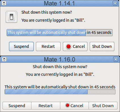
Here is the shutdown screen when tabbing between buttons on Mate 1.14.1 vs. 1.16.0 (Ubuntu-Mate 16.04 vs. 16.10):
Believe it or not, they are tabbing between the same buttons at the same time. If you look closely, you can see how 1.16.0 has a very subtle darkening of the font but otherwise near-useless highlighting. My normal screen resolution puts it around the limit of perception.
I'm always keen to a workaround. Anyone have any pointers how to edit such settings in /usr/share/themes? It may be an easy fix.
Hi @maximuscore and thanks for the confirm. I use compiz zoom to see it, too, but I’m wondering how monitor characteristics might affect how others see it.
I realize all the themes were converted to gtk3 and general appearance matches quite good, and may have been a major effort. That’s “TraditionalOK”, BTW.
I’ll bet it’s as simple as highlighting had little or no priority to end up this broken. I’d gladly put in some time for it but it’s not at all obvious how to tweak gtk3 themes. Anyone?