Since I upgraded about a week ago to 20.04, I switched to Mate rather than Gnome as flashback doesn't work very well any more. I can see several advantages to mint, but it is taking me time to get used to it.
One problem I've had over the past couple of days is something that has changed without me being aware of doing anything. The boarders have become extremely narrow. I understand not seeing them in full screen mode, but it makes adjusting / resizing them in window mode almost impossible unless you significantly lower your mouse sensitivity. The only place it can easily be done is the wide bar at the top of windows. The boarder line is literally just 1 pixel thick. Something doesn't seem right to me.
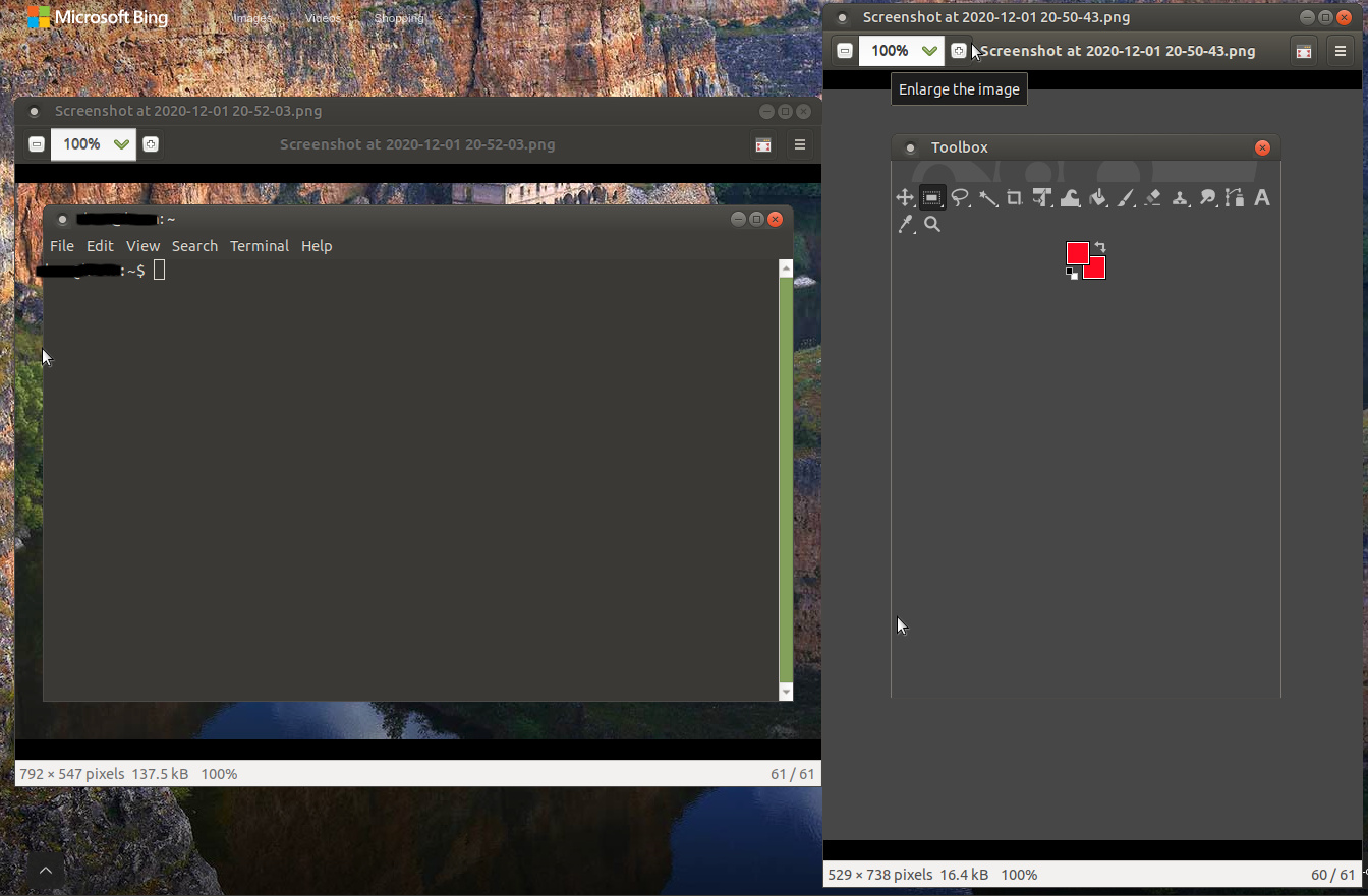
As I can't upload two, I merged them together and took another print screen. This is just showing several windows. The terminal and the toolbox in GIMP image editor (which is an adjustable window).
The boarders seem so narrow that in gimp, you can barely see it as a window. And with every application, you need to line the very tip of your cursor arrow in line with the 1 pixel wide boarder to adjust it, or it isn't possible.
I'm really not sure what has happened here, but it certainly wasn't like this when I first upgraded, so I must have triggered it, or something unexpected changed it.
The things that I'm aware of changing relating to the interface in the theme in the control centre since the upgrade and resizing the top and bottom panel. But this was well before this issue occurred and it doesn't seem at all related.
Make sure you are using Marco window manager with compositor enabled. This should give you invisible window borders that extend beyond visible window borders to make it easier to resize windows.
You should be able to check in MATE Tweak or in System Monitor > Processes tab which window manager is running.
Or... You can change your window manager theme, if you don't care so much about looks as you do about functionality.
For the record, go to the System menu -> Preferences -> Look and Feel -> Appearance. You have a choice of a number of themes, and if you then hit "Customize" (a button below the listing of themes), you can choose other window manager themes. IMO, TraditionalOk is the best theme installed by default which also has large "window frame decorations".
The only possible issue with @mrtribute's suggestion here is that enabling compositing usually slows window redraws down, which means don't try to produce a Hollywood film using GIMP with a compositing window manager and less-than-current graphics hardware!
Right, I have tried what @mrtribute suggested and it was in Marco with compositor disabled. Not exactly sure what this means myself, but enabling it has allowed me to have what I consider a reasonable amount of leeway either side of the boarder of the window that still allows you to change size. With this disabled , it literally does seem you must select the pixel wide boarder or else it can't be adjusted.
Having briefly tried out the "TraditionalOK", while it is too bright for my liking, i think it has reminded me about what I'm missing from the interface i had with gnome and ubuntu 18.04. The thicker boarders at the edge of the boarders and even the shadows helps so much.
I am aware I can change the panel colours which I find odd being white, but then when I put them to grey, they black text becomes hard to read and the time and date doesn't seem to have an option to change the text colour.
Knowing that this theme does seem better, I'll probably need to look around to see if I can work out a way of getting the colours a little darker. Otherwise, i can see the advantages to it so far.
I've also tried New wave as well as skipping through all of them to get an impression. New wave seems the most similar to what I am used to. I prefer it to TraditionalOK / green as is has obvious boarders, but they are not white.
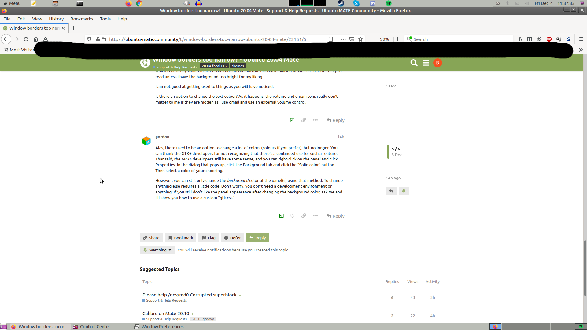
The one thing I would like to work out how to change is how to adjust the colour of the text in the panels. As I am used to dark themes in a great deal of applications I use (youtube, skype, discord Spotify), the top and bottom panel being white is very distracting. I've toned it down to light grey, but the result is as this image shows:
The volume and email icon obviously don't adjust to this. I would rather have the panel close to black, or very dark grey which is all I remember it being since I've used Ubuntu. I actually remember 14.04 which my old machine still runs having this new wave theme, but it had dark panels with white text which is basically what I'm after. The tabs on the bottom also have black text which is a little tricky to read unless i have the background too bright for my liking.
I am not good at getting used to things as you will have noticed.
Is there an option to change the text colour? As it happens, the volume and email icons really don't matter to me if they are hidden as I use gmail and use an external volume control.
Alas, there used to be an option to change a lot of colors (colours if you prefer), but no longer. You can thank the GTK+ developers for not recognizing that there's a continued use for such a feature. That said, the MATE developers still have some sense, and you can right-click on the panel and click Properties. In the dialog that pops up, click the Background tab and click the "Solid color" button. Then select a color of your choosing.
However, you can still only change the background color of the panel(s) using that method. To change anything else requires a little code. Don't worry, you don't need a development environment or anything! If you still don't like the panel appearance after changing the background color, ask me and I'll show you how to use a custom "gtk.css".
I think it is going to be worth trying this custom setting. I have tried several custom colours and all that are dark enough for my liking make it too hard to see the date, menu and any other text as it is black.
Gone for grey (probably gray if you prefer ) like this:
Just covered my bookmarks so i don't share them all in firefox.
I still however just fine this quite hard on the eyes, especially since the vast majority of the applications I use have a dark theme. The panels are just distracting, even worse in white. This is about as dark as i can go with the black text still just about being readable. At the expense of making bluetooth, email and volume incredibly hard to see, which luckily doesn't matter for me.
What I am basically after is dark panels (probably similar to the window frames in the New wave theme) and change the date, menu, and tab text to white. Or another way that you think may be suitable.
It is certainly taking me time to get used to mate, so I do have a lot of questions to ask. This partly relates to window boarders. I have looked at window behaviour options and I can't quite figure out how to get applications to go into full screen when you basically maximise the window size. E.g, firefox, spotify, skype and discord - i use all of them in fullscreen, but they always open in window mode with extremely narrow gaps around the edge. I'm unsure why they don't remember what I last had it open as and I seem to manually have to make it full screen every time.
This below is an example of how they open. Even if the last time i had it in window mode was dragged right flush with the edges.
I am wondering if I am missing an option that makes programs remember what window mode they were last used in. But this option doesn't seem very simple to find.
I will probably have to have the instructions carefully broken down for me regarding the custom themes as I'm not very good at following them a lot of the time. Will find out.
I'm going to parody the term "too long; didn't read" ("TL;DR") and coin a new term, "too hard; didn't succeed" ("TH;DS").
I'm thus going to say that, for the time being, changing the panel colour using custom CSS is TH;DS. Therefore I'd suggest just switching back to Ambiant-MATE and software compositing, instead of worrying about dumb theming stuff. If it works on your hardware, then great, by all means, use it.
As it happens, I think I am getting used to these panels now, and i much prefer new wave in most other areas. Now I've had them for over a week, i think I can tolerate these panels bring bright, but certainly better being silver / grey than white. The few things that are hardly visible are luckily all what I don't need. So as it happens, I think I am also less bothered about trying what you suggested than before. Good job if it is too tricky!
It is just too bad that Mate team has gone out of their way to insulate themselves from the users' feedback, otherwise they would have known that their efforts of keeping window border thickness at a fraction of 1 pixel has lead to undesirable consequences of it being too hard to resize windows.
Alas, they do not want to hear back from us and develop away, oblivious to the effects of their efforts.
By now, top corners of windows have become all but non-resizable, and all 4 sides are too hard to grab with a mouse. What is the purpose of these changes remains a mystery. I can no longer find words about this that are polite. This trend of making the UI a challenge to use seems like a bullying campaign against the user, to see how much we can put up with before we explode.

 ) like this: