I am running YaruOK on Ubuntu22 and I am happy with the theme other than above there is more or less no contrast between active and inactive. So Inactive is a very very light grey on white and active is a slightly darker grey on white background. The Inactive would be Ok if the Active were a solid Black or Even Blue as per +/- .
Is there anyway I can change this.
Phil
1 Like
Welcome @comeng to the community!
Looking into this using other themes of this type it appears to be the same on all and I think relates to some setting with regard to transparency for these icons representing back/forward up/down next/previous they have multiple meanings.
Phil
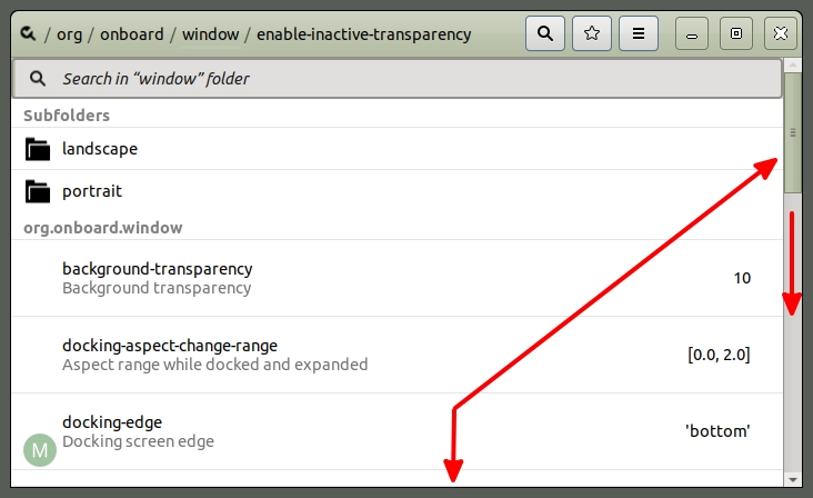
Hi don't know precisely what you are addressing without a screenshot or usage but if transparency as you stated maybe here in dconfig editor. (may not be installed your system) and search org onboard. Scroll down and it lists some transparency settings. Just a thought.
1 Like
Thanks for response
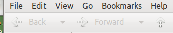
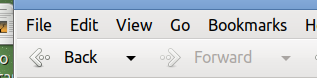
OK1 shows them faint and OK2 shows left arrow highlighted but not enough
Some applications do not have the Forward and Back Words to help they have the arrows only
Will look at dconfig editor
Phil
Sorry system will only let me put one image at a time
Phil
1 Like
OK now see what you are discussing. Believe dconf is not answer.
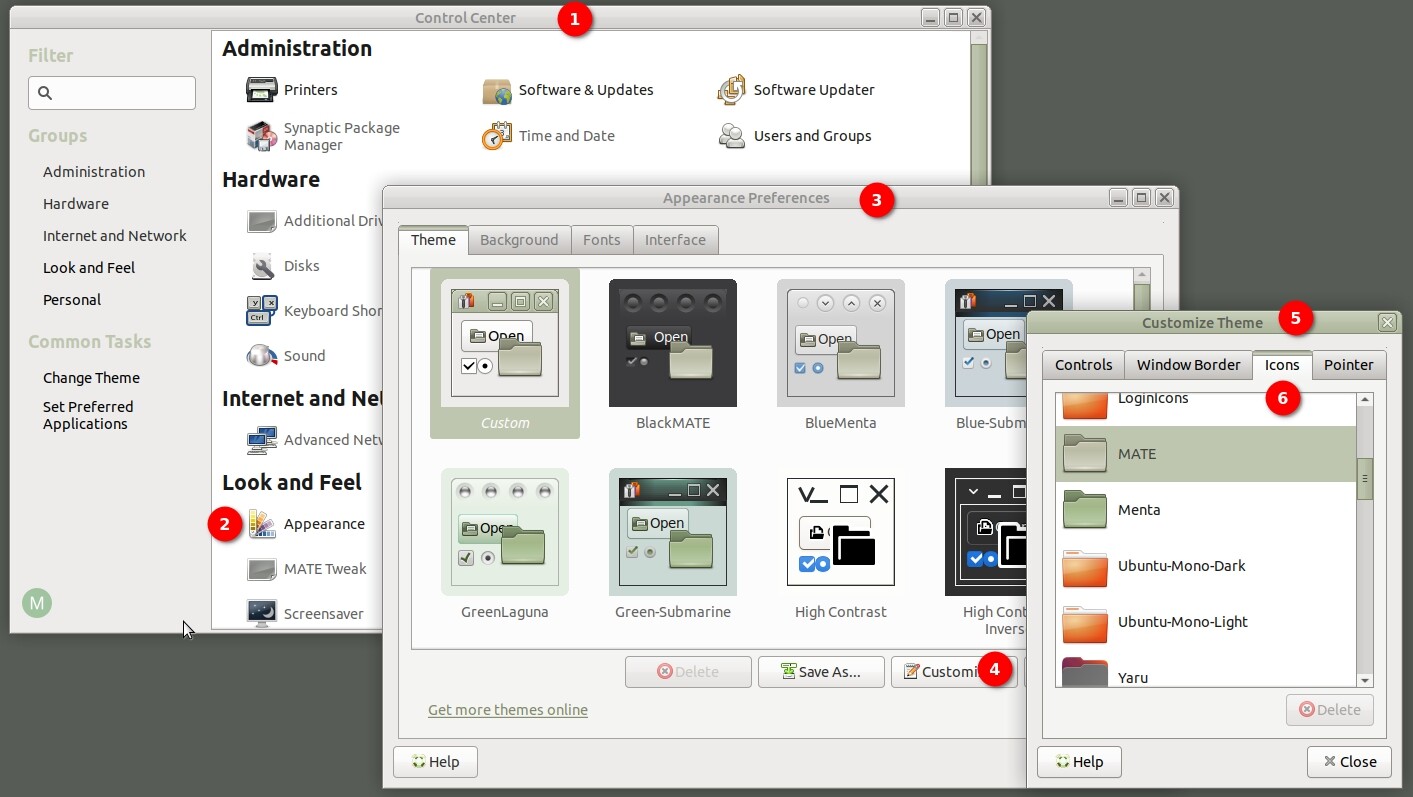
Try steps in image below and change different icons with your window with back arrow showing. You will see the change in that window.
Edit: Didn't pay attention to the forward back as use back button on my mouse. 
Hi
Thanks for that I had already changed icons to Radiant Mate, however that is not the point I would like to use YaruOK in it's entirety if I could find where to adjust the contrast to an acceptable level on these items. This is mainly an interest in finding out "how to" rather than "work round"
Will keep looking
Thanks
Phil