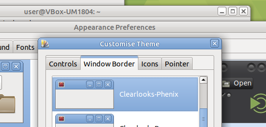
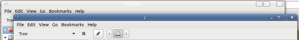
I'm running 18.04 and using clearlooks-phenix as my theme and human as my window border. What I'd like to do is change the color of the inactive titlebar in my applications so as to be able to read what I've opened. Let me show you what I'm talking about -
That is precisely the kind of thing it was possible to fiddle about with when Gnome Color Chooser was still on the go. However, it stopped working when GTK3 came along.
My guess is you will end up having to manually edit some config file somewhere.
Yeah, well I've got /usr/share/themes/Clearlooks-Phenix bookmarked in my superuser caja just for that occasion. So far, nothing I've tried has changed what the inactive titlebar looks like. Manually editing is fine, I just need a good idea of what to actually edit.
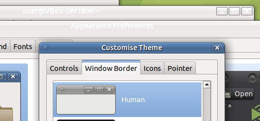
I saw that when you posted it. I created an alternative TrationalHuman theme in my ~/.themes folder and it works just fine. However, the inactive titlebar color is the same white text on white-to-silver mess as my clearlooks-phenix is.
This is merely an annoyance, not a deal breaker in any sense. Thanks Norbert_X.
color (if missing or set to white/#fff) should be added to existing references to decoration, titlebar, backdrop, etc. Since this alone might change the text colour for the 'active' titlebar too.
I haven't tested this, but I know for sure color in CSS concerns the text colour. I'm not exactly sure what elements make up the title bar.
CSS does work by inheritance and hierarchy. Briefly speaking, the line position and other styles in the file could be taking preference and be the reason why it didn't work. Code like this:
Thanks Luke. I had changed the Human metacity-theme-1.xml file previously to get wider borders, so going there again and changing the suggested lines did the trick. I'll continue to experiment along your suggested lines today before I show my results.
Thanks again. I don't know how I blanked on this...
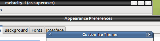
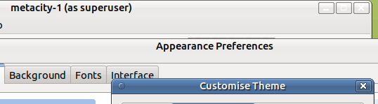
Edit: After a bit of messing around, I have this to show.
I'm not completely sure, but for Traditional Retrospective Desktop we may need to fork these themes and package them with correct colors for ubuntu-mate-artwork (ubuntu-mate-themes or something similar). GNOME Shell will not use them, as they use Adwaita and other huge fresh glossy themes.
Current thread demonstrates that manual patching of themes is not too difficult. But patching themes by end users is somehow not user-friendly.
I was thinking about forking human-theme and placing it in my new PPA, but it is very seldom used, so I'm not sure how much ends users will become happy with it.
Themes are more important than just their looks. They tend to impact functionality too.
TraditionalHumanBlue (and TraditionaHuman [Orange]) display overlay scroll bars when used by caja root. Human displays overlay scroll bars in both normal and root. This is the singular disappointment with the Human theme in my opinion.
Selecting Human results as expected, Human is highlighted when next opening Appearance Preferences.
TraditionalOK displays wide gaps between a few directories (Calibre Library,.gnome2_private, moonchild productions) in Tree View under Home. Only moonchild productions stays widely separated after clicking on it, the others get closer. Perhaps this is because of a space between moonchild and productions?
One of my custom themes has Clearlooks-Phenix control, Human window border, Ubuntu-Mono-Light icons and DMZ_White pointer. No tree view gaps. Works as regular and as root.
Clearlooks-Phenix controls, border and (edited) Ubuntu-Mono-Light icons and DMZ (white) pointer looks good. "Custom" disappears after reboot and Clearlooks-Phenix is highlighted. I also made a custom selection called clearlooks-phenix-try which also highlights. Works. Edit files in /usr/share/themes/Clearlooks-Phenix/
index-theme. IconTheme=ubuntu-mono-light, CursorTheme=DMZ-White,
metacity-1/metacity-theme-1.xml. lines 14 thru 18, changed values from 4 to 6 for thicker borders to grab.
gtk-3.0/gtk-widgets.css. Used gtk_warning.txt to change 12 values throughout to avoid gtk warnings seen in synaptic.
Ambiant-MATE has gaps but otherwise looks acceptable.
I will now use themes that I've edited to include my choice of icons and pointer and stay away from differing borders. Right now, that theme is Clearlooks-Phenix with the additional edits described above.

 Try adding