Dear all,
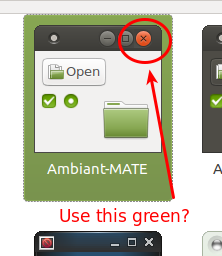
I really like Ambiant-MATE. A very well-done theme!
For consistency, what do you think if we colour the close button in the same green as the other elements?
Dear all,
I really like Ambiant-MATE. A very well-done theme!
For consistency, what do you think if we colour the close button in the same green as the other elements?
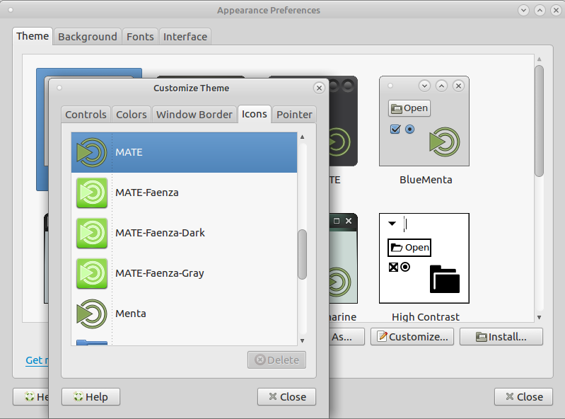
Just to be sure. You realize that icon sets and window borders can be changed or you can add your own.
RAVEfinity maintains a project where you could install their ambiance-colors and radiance-colors packages. Attempt to perform the following (per this article);
sudo add-apt-repository ppa:ravefinity-project/ppa
sudo apt-get update
sudo apt-get install ambiance-colors radiance-colors
After, you can look in their green theme assets at /usr/share/themes and look for the close button there, then colour-shift desired green-coloured assets in gimp to make it just right by tinkering with the colour values for red, blue and green in its channel mixer.
Who knows? Maybe their green theme is exactly what you were looking for anyway and you won’t have to install gimp.
Figured I would do a follow-up in case you were on 17.04; You will have to go into /etc/apt/sources.list.d as superuser and modify the contents of RAVEfinity’s repository file to append packages for Xenial onto it.
Just copy and paste the two lines therein underneath and replace zesty with xenial prior to updating your available repos and you’ll have the packages for 16.10 as well, 17.04, and have the capability to update from outdated packages should RAVEfinity release Zesty-specific packages.
Dear @anon42388993 and @tiox,
Thank you for your responses!
Generally, my post was just meant as a general suggestion to implement directly into the default Ambiant-MATE theme because I believe it would be a nice and consistent enhancement to have the close button in the same colour. There are no other elements inside that theme that are red. So, why having a red close button?
Just to be sure. You realize that icon sets and window borders can be changed or you can add your own.
Yes, but there is no Ambiant-MATE window border in green.
RAVEfinity maintains a project where you could install their ambiance-colors and radiance-colors packages
Thank you! I am not in such a severe need to have this green button to tweak and fiddle with a custom repository.
As mentioned before, my initial post was just meant as a general suggestion to maybe consider for the future of the default theme. ![]()
It isn’t that you were in such dire need, I was just suggesting a personalization option for you. It’s more a case of wanting to re-invent the wheel when previous works exist that would fit your suggestion, even with some minor tweaks.
And I appreciate your suggestion, @tiox! Please do not get me wrong on this.


I think a green instead of an orange close button would provide a nicer consistency throughout Ubuntu MATE, too. Of course a professional new standard theme for Ubuntu MATE would be very nice to see indeed. And we already have a good start with the theme improvements made for 17.04 
@motivation, what elements do you associate with a new “professional” theme? 
This has crossed my mind in the past -- and there's also this topic:
17.04 has had its themes improved, this should continue into 17.10's development too. I'll make sure there's a discussion on this small change. ![]()
Beyond the button colour, the active area should really stretch to the entire corner, so that if your panel layout is set to not have an upper panel, and your window is maximized, you can literally just sweep the mouse to the top right corner, and click, without having to attend to hitting the exact button area (it’s currently a few pixels short of the edge).
@lah7, thank you! I very appreciate your receptiveness.
@orschiro, mainly consistency in look throughout all applications. Then of course a fitting colour scheme and a decent icon theme. But mainly consistency in look: What I would not like for example, is a mix between traditional styled and modern gnome 3 styled applications. As far as I have seen, in 17.04 there is a more consistent scrollbar theme, as well as some improved icon themes for applications (e.g. mate-calculator) and better theming with qt4 and qt5 applications.
I am sorry, I do not understand. What do you want to tell me?
I responded to your question above
[quote=“BrokenCanoe, post:12, topic:12519, full:true”]
Beyond the button colour, the active area should really stretch to the entire corner, so that if your panel layout is set to not have an upper panel, and your window is maximized, you can literally just sweep the mouse to the top right corner, and click, without having to attend to hitting the exact button area (it’s currently a few pixels short of the edge).
[/quote]Completely agree! One of the things I noticed while comparing Ubuntu MATE with other distributions. Closing a maximised Firefox window (or other maximised window) is accomplished with ease on some distributions without need to search for a Close button.
@lah7, What are your thoughts?
For that matter, why not make the button change with the system highlight color? Or give it its own separate option or something. That way we wouldn’t need to take up lots of disk space with new themes that are 99% the same. And we’d be able to choose more than the 13 or so colors in the mentioned PPA.
I wonder if different window managers handle the click area differently? But if it’s technically possible and a “theme thing” then it should be considered.
Damn, if this is possible this would be awesome from an usability standpoint.