Remove Eyes and Fish

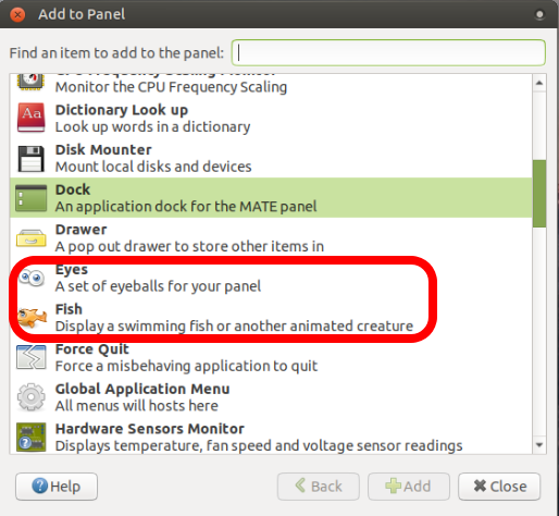
These useless features are inside the "Add to Panel" window:

Right-click on a panel > Add to Panel... > select Eyes or Fish

Honestly, I think both should be removed from the distro, they make the distro look bad and unprofessional, are useless, pointless and just waste time scrolling and make it hard to find what you are looking for.

Please, remove.

Thank you.

1 Like

They are historical artifacts, a reminder of how long some of us have been at this. They don’t cost anything. I don’t think they make the distro look bad, or unprofessional. I know that your very professional scrolling time is priceless, but c’mon, lighten up.

3 Likes

To be honest they do have a maintenance cost, but it’s pretty minor.

Deleting Wanda is not currently up for discussion. She stays :wink:

3 Likes

I have this image of the ‘Eyes’ team (in their hundreds) toiling away at their workstations at Eyes Inc. HQ, trying to get all the new features and bug fixes done by the next release :wink:

2 Likes

That. And @Wimpy cracking the whip. No bathroom breaks for anyone until all the bugs are fixed! :smile:

1 Like

It's Your point of view.

Computers are not the privilege for company and adults only, kids also learn and use on a computer nowadays...
As a matter of fact i found Ubuntu-MATE to be very Family friendly.

The Desktop of my children is not an aseptised desktop, it's their own desktop, they use the computer in their own way with their own "decorations" (it can be scary, but they will grow up).
Ask my 6 years old to remove the fish and the eyes who follow the mouse from the top bar... He will have a completly different opinion than yours.

7 Likes

Some people like having little toys on the desktop, you are not being forced to use them and they are only a couple of KB’s in size!. :smiley:

I understand you find them useless and pointless, but can you understand that others may feel differently about them?. I find Eyes invaluable as an accessibility feature for helping me find the cursor.

6 Likes

Also removing them would result in more maintainence from a technical standpoint as they are part of the MATE Desktop (upstream).

The packages are synced between Debian/Ubuntu (or in the worst case they’re taken out upstream) will impact all other users outside Ubuntu MATE that use the MATE Desktop. :confused:

2 Likes

Another thing to consider is that no matter how tech advances – smaller, faster, more efficient – people will always want cute. “Hello Kitty” phone cases come to mind…

If nothing else. no matter how useless “Eyes” and “Fish” seem. they are cute.

1 Like

Slightly off-topic, but if the Japanese can have Hello Kitty high-speed trains we can have Eyes and Wanda on a high-speed operating system :stuck_out_tongue:

3 Likes

These “features” make MATE’s code more cluttered, sometimes there are bugs(1, 2), they waste space, time of development and increase the size of the ISO for no good reason. And they are going to be around until what… the year 2050? At some point they will be removed anyway.

These comments above confirm my suspicious that the MATE community is infested with trolls that want to hold the Desktop Environment’s development back, they are like some of the comments on the thread about the new default layout(good changes and improvements by the way).

Some of these comments are a red flag for me and I will abandon ship and stop giving feedback, good luck with the project, best wishes.

I think you underestimate the conservatism of “the average user” which can come across as trolling or, at the very least, being deliberately obtuse.

In my day job I have dealings with medical software which, in its Web incarnation, has the same layout and keyboard acronyms - it can be used without a pointing device - as it had in the days of dumb terminals. Heaven forbid that anyone should move or change anything!

(In the end doctors are not there to fuss around with the configuration of software, and that software has got to work).

Linux Mint is probably popular for that reason. It is stunningly conservative; for example, the new theme (the “Y theme”) has been slipped in as a non-default option over the past couple of versions, and it has forked software some distance upstream when the maintainers have made what are deemed to be too many changes.

There are many Desktop Environments. MATE is not 'Desktop Environments' - it is just one. The various DE's have different appeals to different constituencies. The entire raison d'etre for MATE to begin with is tradition/conservative. You say the new default layout is "good changes and improvements" as if this were some sort of objective fact. No, this is your opinion. A lot of people sincerely do not want this. They are not trolls, and you are way out of line for suggesting it.

I will suggest this: Perhaps MATE is not the DE for you. If you want shiny for the sake of 'progress', maybe try Gnome Shell, or Cinnamon, or KDE, or any of a jillion others. I am serious - every project does not have to be on some change for the sake of change kick.

2 Likes

I have to say that although I agree with your overall thesis, I don't fully agree with this statement. @ssspacez brings up interesting feedback about his experience with Ubuntu MATE, which whether we agree or not, can still be used to help understand what the needs are of different members of this community. We need differing point of views to encourage progress.

That said, @ssspacez please understand that MATE is not the same as Ubuntu MATE, and removing upstream components within a distro carries a significant amount of work in terms of maintaining patches and keeping them synchronized release after release, possibly indefinitely, unless the upstream MATE team (which also serves the needs of dozens of other distros) can be convinced that there's benefit in removing said components from the upstream code base.

In addition to that, I have to say that keeping the fish around has been a blessing when debugging panel and applet issues. It serves as both a litmus test of things working (or not) and is also a good example of resilient code that can be reused when creating new applet; after all it has withstood the test of time quite admirably even as MATE blazes forward with integrating newer technology and adding features not thought of at the time of the fish's creation 20 years ago.

6 Likes

I guess I needed to be reminded of this, too :slight_smile:

First things first: dont’t remove the fish!!!
(And I’m glad most agree. :slight_smile: )

On a more serious note, I am new here, but I, for one, am certainly not conservative, no matter if we are talking about politics or DE’s. When I first heard of MATE I didn’t even give a thought about even trying it out, convinced it was an obtuse retrogarde idea, anyway. It’s not for me, I thought. I was and still am convinced we need innovation, and that experimentation is a good thing, as it may bring out better things. It is why I loved Unity desktop – it proved to be the most efficient one for my workflow, as a writer. But then Canonical announced they’re deprecating Unity development and maintenance. So after I tried Gnome-Shell, that honestly felt like a step backwards for my usability, I decided to try out Ubuntu MATE after all, because it seems to be the only DE that has a functional HUD – and that’s where I “bought” it. I don’t think the HUD is a conservative way of doing things on a computer desktop…

However, one of the most cool things about Ubuntu and GNU/Linux generally is not it’s dull (and reactionary, really) corporate usage potential, but the fact that “it brings the fun back into computing”, as everybody used to say years ago. We really shouldn’t take this aspect away.

I was VERY disappointed when I saw the Red Hat corporate dullness crusaders succeed in stripping away ddate from util-linux upstream. Their argumentation for it was actually pretty conservative and reactionary… In the same period, Gnome (also Red Hat sponsored) excluded Wanda, Eyes and similar toys and easter eggs from Gnome 3, and there generally seemed to be a growing tendency of taking all the fun from GNU/Linux away, which is a very reactionary thing to do, if you think about it.

So yeah, it’s ironic that I came to Ubuntu MATE, after all, in search for a more modern and efficient experience than what Gnome Shell has to offer (HUD ftw!). Mutiny and Contemporary layouts combined with Synapse are very cool. And yet, I was happy as a child when I found good old friend Wanda again. :slight_smile:

Computing should be fun. So let us all, from devs to end-users, have it, in a respectful manner. Don’t take it away. And, as it was said above, it’s not all that useless, after all. And even if it was just for fun, I really don’t think fun itself is useless at all. :slight_smile:

And if a record is not up to my tastes, I just don’t buy it. I’m certainly not asking the record store to remove it from shelf…
4 Likes

No, they arent’t useless. I use the eyes applet on all of my installations, even at business. It is always a feeling of micro-fun when quickly glancing at the lovely eyes while doing any kind of work.

You won’t believe it, as I’m really surprised as well, but when showing my Ubuntu MATE desktop to collegues - presenting all the great features and effects to them like e. g. Easystroke with Compiz fire effects, the compiz cube and wobbly windows, Synergy between the mate host and a Windows remote client and so on and so on … but suddenly they tell me: and the eyes are so cool and funny as well.

2 Likes

Now, after reading @7even’s post, I just felt compelled to put them both on my desktop… XD

I’ll probably get bored with one of them sooner or later, and that’s fine, as I can add them and remove them as I wish. But I really wouldn’t like to loose the option itself. :slight_smile:

What’s the history behind the two? Can anyone explain why they are around?