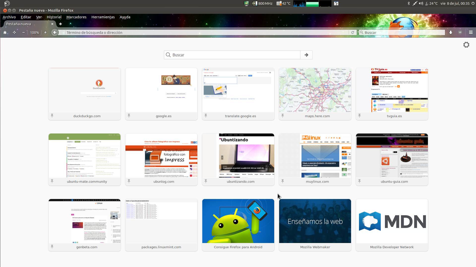
When users launch the Firefox browser for the first time, they are greeted with Canonical’s start page. Should UM have its own start page with links specific to the distro? Maybe even, there could be user agent matching, so when the page detects you’re on a specific browser, extra options for that browser load in a separate panel?
I’m sort of thinking of a remodeled Firefox start, except more browser-agnostic and informative for new UM users. For my idea to come true, it would require one part of the webpage that would do browser detection via an iframe and redirect.
Eh, it would be more a digest of popular and trending topics like what users receive via E-Mail right now. So I am thinking, if maximized, digest to the right side (or left for RTL), a Google search on top, and browser shortcuts on the bottom.
All of this would open in a new tab, which would reduce complexity in coding, while giving users a resource to access certain browser functions that have their own dedicated pages in the browser.
One blemish in this idea would be use of links / links2, which should outright be disallowed. Another issue is if the browser in use doesn’t have any of this, which could also be solved fairly easily; Have nested iframes / div cells. The frame on the right would remain the same, but the frame on the left would be dynamic. The top and bottom frames within the left frame would be static, with the defined shortcuts page in the bottom being browser-specific, so it gives the illusion that only the bottom frame is the dynamic one when it’s really the left.
If an unsupported browser is used, it defaults to a left frame that is just google search, and if you wanted to make it more practical, write a cookie that stores recent queries locally, presented as list. Due to size constraints of having a top and bottom frame, for supported browsers, have recent queries in a drop-down box. This would mean unsupported browsers receive a different implementation of the Google search with recent queries, if whoever makes this wanted all that extra vertical space populated with something, else just load the version with drop-down.
I agree partly!
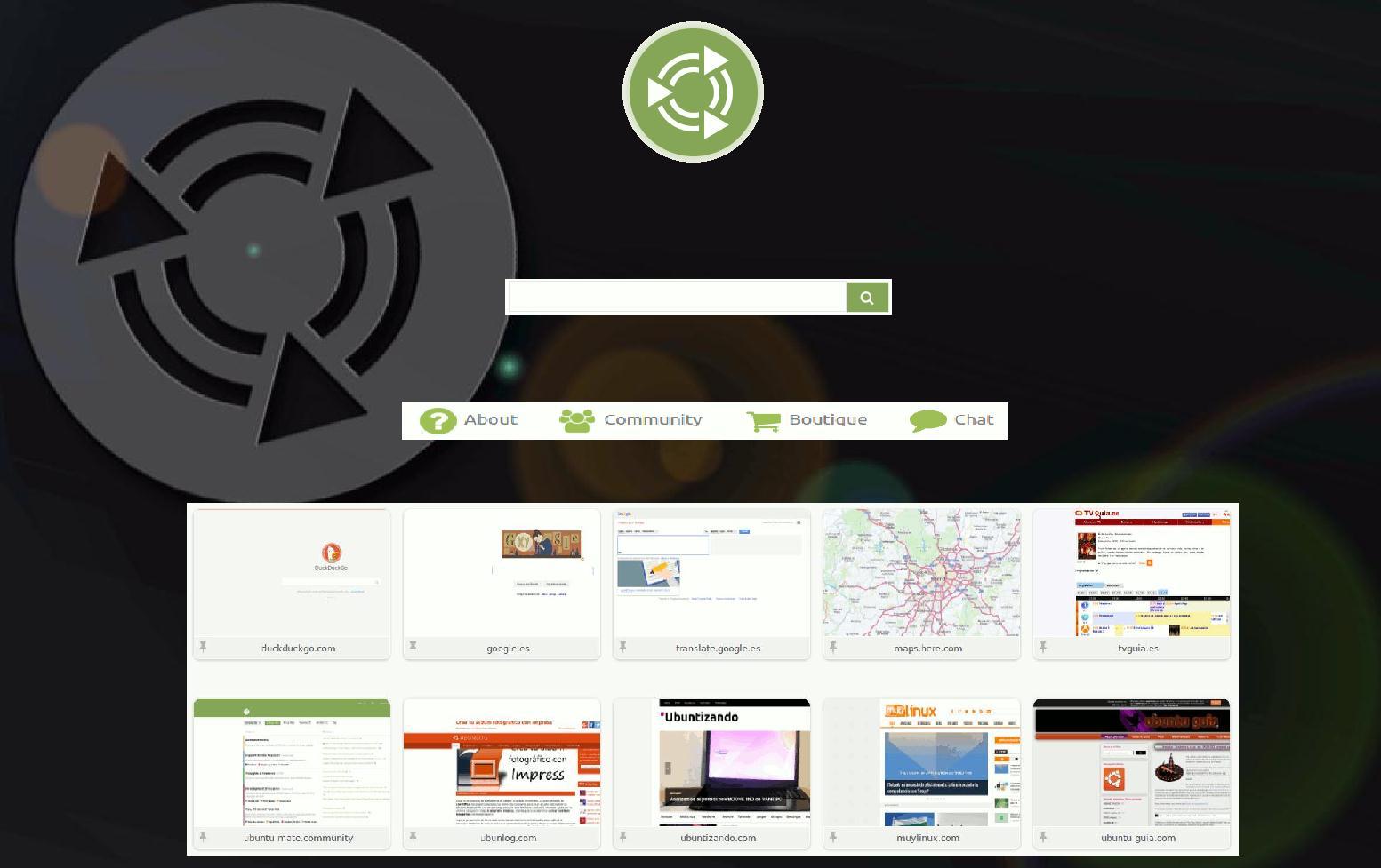
You should not modify Firefox, but a unique start page would be very cool and a great individual touch for the distro. I think something like openSuse has (with their little animated chameleon on the start page) would be nice. Oh and not with google please, as it isn’t a fair search engine. DuckDuckGo is a suitable search engine which respect your privacy and which is open source friendly (in fact, they spent a lot of money to open source initiatives), and in my opinion it is even technically better than google!
I agree with UM adaptations but disagree with implementing a google search. That would be a privacy violation that I could not accept. The idea of having a specific UM startpage is a great one though.
You should realize that Ubuntu does this already with replacing the default start page for Canonical’s. I’m asking for a Ubuntu MATE twist on the idea, of improving the start page with awesome extras and browser-dependent shortcuts.
To @wimpy: The best way to do this IMO would be to load parts of the page depending on the user agent of the browser in use. That way, it can be easily tested using User Agent Switcher in Firefox to see if anything goofs up.
It may also rely on Javascript if HTML alone doesn’t allow for this. I certainly hope you’re comfortable with that. There are addons for Firefox that serve similar purposes but that would be a bit harder to ship, versus a UM start page with all the goods held server-side.
The homepage of Ubuntu Mate would be great, but everyone has their tastes and use it or not,
I used Ubuntu 14.04 and had his homepage, I ended up changing it because they do not use Google as the default browser, I do not like using tracing users. (You can put ads but not track). Only use it to enter my email. for internet use Duck Duck Go about your privacy, but I like to start having major markers for quick access,
It works, the search is currently "re-using" the code for Ubuntu's start page, which is Google.
Defaults in Firefox are actually replaced by the Ubufox extension (provided in package xul-ext-ubufox). My understanding is that this package will need to be forked, change some stuff and create a new package with this Ubuntu MATE branding in Firefox.
So I guess the question is, what is desired for this start page?
DuckDuckGo search by default?
Or... an option to choose between DuckDuckGo or Google?
@tiox, you seem to desire Firefox shortcuts, which ones?
Preferences? (about:preferences)
Recent Tabs? (about:newtab)
They could be links at the bottom, or top-right...
I'm not sure about other Firefox functions like history, downloads, etc...
It's certainly possible to have browser-specific pages, but we're assuming users will manually switch their browser's home page in say, Chromium/Chrome?
I really like this. I am actually going to go against the grain and say that I would prefer it to be Google . While I appreciate Duck Duck Go, I think Google is really what most users are expecting.
I always understood MATE as something that was easy to use for most people and whether we like it or not, most people expect Google searches. In addition, I believe that people that would be likely to use Duck Duck Go would likely already know how to change their search engine to have that.
Either way, just to reiterate, I REALLY like this start page. I would maybe add a link to the getting started documentation also.
Wonderful design! Using a search engine is not just a matter of convenience but an ethical and political choice. Using Google as the default engine is counterproductive to a free, secure and privacy-conscious browsing experience, especially for new Ubuntu MATE users. For the default search engine I would suggest Ixquick. It presents Google-like results without violating your privacy and has options to open any search result via Proxy. For the Googlers among you, why don’t you use Startpage instead? @CrazyDesi
A good second alternative for the default search engine is DuckDuckGo, as has already been suggested.
Search engines for the Option Box:
Startpage (different from Ixquick in that it only uses anonymized search results from Google)
DuckDuckGo (should be offered here if Ixquick is made the default search engine)
Ecosia (a search engine committed to the environment but which sends IPs to search partners, hence to be used with caution)
Google (perhaps with a warning to new users that it will violate their privacy)
Fare enough. I think startpage is a good idea, but I found that I can’t really block their ads through ublock. I think DuckDuckGo may be a better option on second thought.
This also has to do a little bit with what we talked about in the other thread. There are some ethical and moral issues that need to be ironed out so that we can know the stance to take in these kinds of issues.
So for defaults, I would choose Google. @Wimpy says Google too. I also agree with @CrazyDesi that many users would likely expect it to be Google. For instance, my friends and family have never heard of DuckDuckGo,. they just want a familiar search engine.
For the privacy concerned, I’ll add a radio button underneath to choose between the two, and retain that preference… assuming cookies work.
As the start page will be provided on a server (like http://start.ubuntu.com is), this can be further developed/changed in future.
@Josele13, I’m afraid I respectfully disagree with your idea on a background and recent tabs.
Backgrounds would likely pose a problem for colourblind/visually impaired users from seeing the page clearly.
The recent tabs isn’t technically possible with the current plan (to rebrand the start page) and probably would to become some sort of extension…
That would be a lot more difficult to maintain.
This would duplicate functionality. We can just link to about:newtab.
We should really keep the simplicity on par with Ubuntu’s Start page and Firefox’s (about:home)
Hello lah7, it was a suggestion for improvement,
but it would not be recent pages, would speed dialers, only 8 or 10 with the places most visited, with that you limit the effort to schedule too much.
I only mention Firefox. Refer back to what I said; I want the Ubuntu MATE start page to have browser-specific elements, and the easiest way to do that is to have a check for which browser the user is running so the page can load browser shortcuts relevant to that browser.
There are a lot of things for Firefox that are accessible from the address bar. You could probably use about:about to find them. I would say to optimize for Firefox and derivatives first because that is the browser by default, and have Chromium / Chrome play second fiddle. Everything else will have tor be based on user requests.
Why not engines for various Ubuntu and Debian communities, including our own?