To present a more polished appearance and user-friendly experience, may I suggest the following changes:
1. On the home page, the Raspberry Pi logo is not visible unless you scroll down. Thus a significant percentage of new visitors will immediately click on 'Download', after linking here from one of the many articles about Mate on various blogs & computer industry news sites. (This is a statistical inevitability.) And when the visitor clicks on Download without scrolling down the page, they will miss the Raspberry Pi logo which links to some information which impacts user experience, such as:
- Notes about SD card performance
- The experimental VC4 driver can be enabled via '
raspi-config' - The arm64 images do not feature any VideoCore IV hardware acceleration
...They will go on to choose their model and release, and then they will see the Download page with a button for Release Notes at the top. Because it is highly visible there, I propose placing another button next to "Release Notes" which links to the page referenced above, so more people will view the information. (It is equally important as the release notes.)
I also recommend that the section entitled "Making a microSDHC or USB" should be updated to include more polished and uniform installation methods, such as the open source 'Balena Etcher.' Furthermore, the instructions for Mac are missing entirely, and linking to a cross-platform application like Etcher will simplify documentation.
2. The forum user interface prevents me from posting in the following sections (i.e. the 'New Topic' button is disabled):
- Tips, Tricks & Tutorials
- Multilingual discussions
--But I can post in all of the other areas! This makes no sense.
3. Regarding the Release Notes here:
"No one reads the release notes, isn’t that right DasGeek?"
--If the type was a bit larger, they might. Then they will focus on scrolling and will not notice the intimidating size of the page until they are halfway through, and compelled to finish by sheer curiosity. ![]() With equal respect for common accessibility issues such as poor vision, I therefore recommend that you increase the size of the text by at least 50%, and here as well:
With equal respect for common accessibility issues such as poor vision, I therefore recommend that you increase the size of the text by at least 50%, and here as well:
4. Regarding the following comment and the whole section:
Charles Babbage wasn’t lying when he said “The only thing that would make my Difference Engine any better would be a modern customisable desktop environment that didn’t deviate from traditional desktop paradigms (unless I wanted it to.)” --In a long lost diary entry Ada Lovelace scribbled “If only my code could be matched to an OS that had a perfect blend of usability and style accompanied by a handpicked selection of quality software packages.” --ENIAC, moments before being unplugged in 1956, spat out a final message: “Give us a reboot when Ubuntu MATE 18.04 LTS is out will ya?
-- Gold star for charming wit and historical references, reminiscent of "Creative Computing"
...and HAL9000 replied: "I'm sorry Dave, I'm afraid I can't do that."
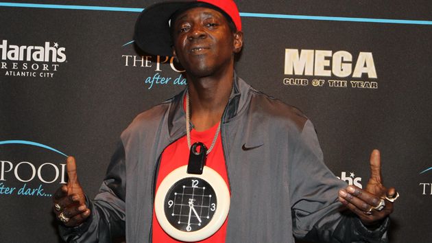
Speaking of computing pioneers, here is a true historical anecdote that is equally improbable: an early software developer who wrote programs in pure binary wore a clock around his neck decades before this guy:
--For a retrospective future then ! ![]()