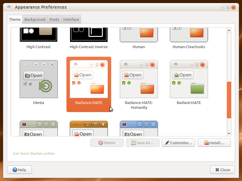
I would like Mate to do away with the green theme. The green folders, green highlight in the menu when you're highlighting an app to open. Please pick a different color or give the user a selection of colors we can use for the menu highlight and etc.
Unfortunately, the GNOME team decided that user choice was - and I'm quoting here - "less important than [GNOME's] branding". Yeah. As a result, any changes to colors are quite time-consuming and involve editing multiple files by hand.
Even more unfortunately, that's just the EASIER half of the problem. Because the GNOME team has no graphics developers, several pieces of the UI use fixed-color images. So to change the color of a theme consistently across every part of it, you also have to edit up to 60 images. That's a massive waste of time which was completely avoidable, but that's how it is.
So while your request is absolutely reasonable in the abstract, and should be quite trivial in practice, it in fact requires the tiny unpaid MATE team to put in hours of work for even just one new color, let alone "a selection" of them.
I've actually recently done some of the first, "easy" part for a theme based on the classic "Clearlooks" so that the colors can be changed in just a couple of minutes (and, potentially, may someday write a little app to make it even easier). But that's only one theme out of the dozen or so that MATE currently ships with, and doesn't address the fixed-color images of the second part.
One can go to the linux mint repositories and download the x or y icons and mint themes as a deb.Simply install.This may your best alternative to hours of tedious work trying to modify an existing icon set and themes.In case this interests you here is the place to go. packages.linuxmint.com
Adwaita Dark uses pretty tame blues. Just saying. It's dark, high contrast and easy on the eyes.
The system indicator icons suck solid ass. They don't look right. So do Pop!_OS icons. MATE themes need old-school GTK2 stuff, not CInnamon / GNOME-Shell stuff.
I disagree, I like the green theme. It says "Look at me, I'm green, and I don't care what anyone thinks" because green is one of the least popular colors.
Stick with the green, and request custom themes from the community. Tacky designs are the primary drive behind innovative designs.
Okay hang on. You get that Nemo crap off your post right now because I never tested that in current Ubuntu, and it's become more of a hassle than it's ever been to get the Cinnamon FM working in MATE.
The old Mint themes stuff, that ought to go as well because that's outdated information. Current iterations of Ubuntu comes with a gimped version of folder colours, with no means to supersede it from what I had found and current Mint themes are optimized for Cinnamon (though, I should check out the MATE variant and see if there is a special icons package for MATE DE).
It's well and fine I see you have interest in my posts, but don't shotgun old info to answer a new question. Half of my past content no longer is valid here and I've never took the time to append with a notice of invalidity in current iterations, or to append with new information for software I don't ever use anymore.
I have made my point clear. To new users here is some advice. Do not let anyone tell you that you can not or should not change "YOUR" OS as you please. We all have the right to choose what we install or use regardless of where those changes come from if it makes our user experience better. To all a good day or night as the case may be.
That's still well and fine, and people should have the choice to use whatever software they feel comfortable with. However aside from XFCE most of the file managers are generally the same with some extra features available as plugins, and I've sort of been over using Nemo for a bit... not that it should limit what people do with it, but the limitations really stem from Nemo being too integrated into Cinnamon to be comfortably used outside of anything else, unless somebody wants to make a PPA which substitutes and redirects some calls it makes for features that Nemo can't find related libraries or other software to function.
Man we've really jumped the rails on this one. But yeah, point taken, regardless of relevance to the topic of personalization.
A'ight y'all I think I have a decent resolution for everything being this painfully organic, soupy green. Would the MATE art team consider working on a "Flat MATE" icon and theme package which uses Canta as a base theme? Canta is primarily focused around green colours, so I feel like a slight tweak here and a bit of touchup there would produce a decent default for us Ubuntu MATE users next year.
I don't see the problem with this. It's a crisp theme and a fresh look.