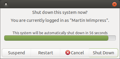
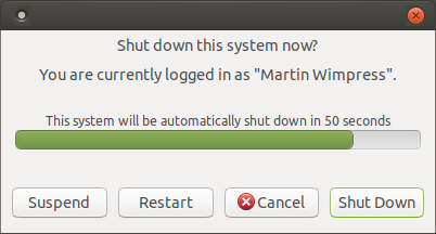
Since the MATE Desktop migration to GTK+3 some some buttons started to look like this:
Soon in Ubuntu MATE 17.10 they will start to look like this:
You can thank @lah7 for presenting an impassioned argument to return the button to a more traditional style when we met at the Snap sprint in London earlier this year
This is a theme change, not something you can toggle in MATE Tweak. Also, only message dialog button are affected. Linked buttons do make sense in other places and they continue to function normally there
For the visually impaired amongst your users, this is a huge improvement. Being able to see where one button starts and another ends makes a difference! Thank you for listening. It’s something UM does really well.
Ubuntu Mate has proven itself, over time, via the thoughtful choices of its devs, to hold to a design principle of being traditional and thoroughly modern simultaneously.
That’s not always an easy balancing act to maintain - especially when one is dependant on developments occurring outside of one’s control. But, the Ubuntu Mate team has delivered on it time and again.
Speaking of that, Discord made the regrettable decision to conjoin the video and voice chat buttons for the video mode beta, with only the pointer illuminating where the cursor is. I can see an argument about how somebody would select one or the other by accident due to this.
@Wimpy
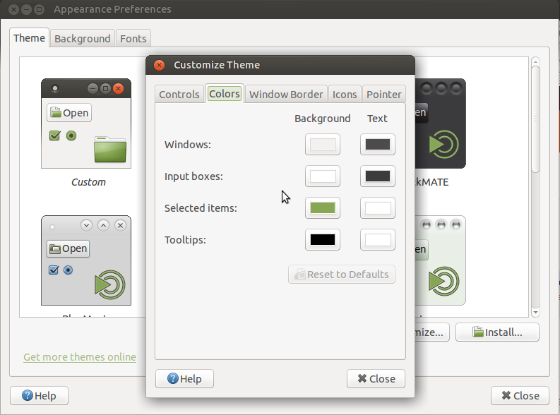
Speaking of tradition, any chance of bringing back the Customize Theme/Colors we lost with the transition to GTK3?
It makes a considerable difference to me.
Looks like a positive move to me. I had thought that the overlap of the button edges might be a bug, a problem with my graphics driver or some other rendering issue!
I like easily understandable generic buttons. It’s what I think a golden category old style thing. Inspirational because old and simple puts focus on life and work. I don’t mean the Apple fashion fancy simple of course. My opinion on style changes is why not make the old version available as well every time? Choice always adds extra value to products.
I’ve just checked this in UM 17.10 and the buttons are still showing the older design for themes such as OSX Arc, I’m assuming this is only specific to certain themes that have this change implemented?